Figure and Axes
The matplotlib hierarchy you actually need to know. State-machine vs object-oriented APIs — and why every serious notebook uses the latter.
Written and reviewed by Shreyash Prashu Last reviewed
What you'll learn
- The Figure / Axes / Axis hierarchy
- The two matplotlib APIs and when each fails
- The
fig, ax = plt.subplots()pattern you should use every time
Before you start
The previous lesson leaned on one unexplained line — fig, axes = plt.subplots(2, 2) — and then drew
onto the axes it handed back. That fig / axes pairing isn’t incidental; it’s the entire mental
model matplotlib is built on.
Almost every confusing matplotlib error traces back to not having it straight. Learn the hierarchy once and the library stops being mysterious.
Matplotlib has a reputation for being verbose. Most of that reputation comes from people mixing two different APIs without realizing it. Learn the hierarchy once and the library becomes mechanical.
The hierarchy
Three nested concepts:
- Figure — the entire canvas. One window, one saved PNG, one HTML output. A figure has a size in inches and a DPI.
- Axes — one plot area inside the figure, with its own coordinate system, title, and axis labels. A figure can have many Axes objects (a 2×2 grid is four of them). “Axes” is matplotlib’s word for “a single chart.”
- Axis — the x or y number line on a given Axes, with its ticks and
label. You’ll touch these through
ax.xaxis/ax.yaxisfor fine-tuning.
They’re separate objects because one canvas often needs multiple independent coordinate systems. A 2×3 grid of subplots is one Figure containing six Axes, each with its own x/y scales, titles, and data. Keeping them separate lets you address each chart individually without fighting over a single global state.
The confusing word is “Axes.” It’s singular — one Axes object is one chart. A figure with four charts has four Axes.
The two APIs
Matplotlib ships two APIs that do mostly the same things:
# 1. pyplot state-machine — implicit "current figure"
plt.plot([1, 2, 3], [4, 5, 6])
plt.title("Hello")
plt.show()

# 2. Object-oriented — explicit figure and axes
fig, ax = plt.subplots()
ax.plot([1, 2, 3], [4, 5, 6])
ax.set_title("Hello")
plt.show()
For a one-off scratch plot, the state-machine version is fine. The moment you want any of the following, the implicit “current figure” gets confusing fast:
- two subplots
- a custom layout
- an inset
- shared axes
You end up calling plt.gca() (get current axes) and praying it’s the one
you meant.
The OO API takes one extra line and never gets ambiguous. Use it everywhere.
plt.plot and ax.plot are not the same call. plt.plot routes to
whichever Axes matplotlib considers “current” at that moment. That can
silently be the wrong one if you have multiple subplots or call plot
from inside a function. ax.plot is explicit: it always targets the
Axes you hold in your hand.
The pattern, fully worked
import numpy as np
import matplotlib.pyplot as plt

# Simulated monthly active users for a SaaS product
months = np.arange(1, 13)
mau = np.array([1.2, 1.5, 1.9, 2.4, 3.0, 3.7, 4.3, 4.6, 4.8, 5.2, 5.8, 6.5])

# 1. Make the figure and ONE axes inside it.
fig, ax = plt.subplots(figsize=(8, 4))

# 2. Plot on the axes.
ax.plot(months, mau, marker="o", color="steelblue", linewidth=2)

# 3. Label everything on the axes.
ax.set_xlabel("Month")
ax.set_ylabel("MAU (millions)")
ax.set_title("Monthly active users — 2025")

# 4. An annotation right on the axes.
ax.annotate("Product Hunt launch",
            xy=(5, 3.0), xytext=(6.2, 2.0),
            arrowprops=dict(arrowstyle="->", color="black"))

# 5. Light grid for readability.
ax.grid(True, linestyle="--", alpha=0.4)

# 6. Optional but nice — remove the top and right spines.
ax.spines["top"].set_visible(False)
ax.spines["right"].set_visible(False)

fig.tight_layout()
plt.show()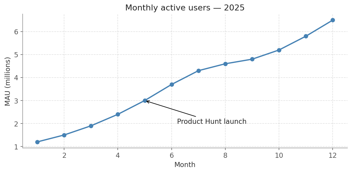
The label sits below-right at (6.2, 2.0); the arrow points up-left to the data point at (5, 3.0).
The arrow points up-left — from the label at (6.2, 2.0) toward the tip at (5, 3.0), which is up
(higher y) and to the left (lower x). Every line in that code operates on ax, an explicit object.
There’s no hidden “current axes” state, so this code can be reused inside a function, a loop, or alongside other plots without surprises.
The translation table
If you’ve inherited pyplot-style code, this is the renaming you’ll do 99% of the time:
| pyplot (state) | OO (object-oriented) |
|---|---|
plt.plot(x, y) | ax.plot(x, y) |
plt.scatter(...) | ax.scatter(...) |
plt.title("…") | ax.set_title("…") |
plt.xlabel("…") | ax.set_xlabel("…") |
plt.ylabel("…") | ax.set_ylabel("…") |
plt.xlim(0, 10) | ax.set_xlim(0, 10) |
plt.legend() | ax.legend() |
plt.xticks(...) | ax.set_xticks(...) |
plt.grid(True) | ax.grid(True) |
Notice the pattern: OO methods that set a property are named
set_xxx. OO methods that do something — plot, scatter,
legend, grid — keep the same name.
Saving the figure
fig.savefig("mau.png", dpi=200, bbox_inches="tight")
fig.savefig("mau.svg")                          # vector, scales perfectly
fig.savefig("mau.pdf")                          # great for reports
bbox_inches="tight" trims the whitespace around the figure — almost
always what you want for embedding into docs and slides.
figsize, DPI, and font — see the effect live
figsize=(width, height) is in inches. At dpi=100 (the default),
an 8×4 figure becomes 800×400 pixels. Raise DPI for print; leave it at
100 for notebooks. Font size controls tick labels, axis labels, and the
title — too large and they clip or crowd the data area.
Drag the sliders — see what figsize, DPI, and font actually do
fig, ax = plt.subplots(
    figsize=(8, 4),
    dpi=100,
)

ax.tick_params(labelsize=12)
ax.set_xlabel("Month", fontsize=12)
ax.set_ylabel("Value",  fontsize=12)
ax.set_title("MAU trend", fontsize=14)In one breath
Matplotlib nests three objects:
- Figure — the whole canvas, one saved file.
- Axes — one plot area inside it — the confusing singular word for “a single chart,” so a 2×3 grid is six Axes.
- Axis — the x or y number line.
It ships two APIs:
- pyplot state-machine (
plt.plot,plt.title) that guesses the “current” axes. - object-oriented API (
ax.plot,ax.set_title) that targets an explicit object.
Start every plot with fig, ax = plt.subplots(...) and call methods on ax — it costs one line and never
gets ambiguous. That matters the moment you have multiple subplots or plot from inside a function. OO
setters are prefixed set_ (set_title, set_xlabel); the doing verbs (plot, scatter, legend,
grid) keep their names.
Practice
Quick check
plt.title('foo')?A question to carry forward
You now have the scaffold: fig, ax = plt.subplots(), then everything onto ax. And in the worked
example we reached for ax.plot — a connected line — without justifying it. That was right for monthly
users, where the points have a natural order.
But matplotlib hands you a second workhorse, ax.scatter, where each point stands alone — and using the
wrong one produces a meaningless tangle.
So the question to carry forward is: when do you connect the dots, and when do you leave them apart? The next lesson, line and scatter plots, draws the line between matplotlib’s two most-used charts.
It shows how to encode up to four dimensions at once in a single scatter and gives you the one-question test that settles which to reach for every time.
Practice this in an interview
All questionsSmall multiples (also called trellis or facet charts) repeat the same chart structure across panels, one per category, using identical scales, axes, and visual encodings. They let viewers compare patterns across groups without the visual tangle of many overlapping lines or bars, and are the right choice when you have more than three to four groups or when overlap obscures individual trends.
Match the chart to the relationship in the data: comparison across categories calls for bars, trends over continuous time call for lines, correlation between two numeric variables calls for a scatter plot, and distribution shape calls for a histogram or box plot. The question you are answering — not aesthetics — drives the choice.
Charts mislead when visual area or slope no longer encodes the underlying ratio faithfully. The three most common traps are a truncated y-axis that magnifies trivial differences, dual axes that let the designer set any ratio between scales, and 3D perspective that foreshortens far elements and inflates near ones.