Line and scatter plots
The two workhorses. Lines for sequences, scatters for relationships — plus markers, colors, and the bubble plot.
Written and reviewed by Shreyash Prashu Last reviewed
What you'll learn
- When to use
ax.plotvsax.scatter - Markers, linestyles, colors, multiple series
- Encoding extra dimensions with size and color (bubble plots)
Before you start
The last lesson left a question hanging: we reached for ax.plot to connect the monthly-users dots,
but matplotlib offers a second workhorse where points stand alone. Choosing between them is the whole
craft of this lesson, and it comes down to one question — does the order of the points mean anything?
Two plots, used constantly:
- Line plot —
ax.plot. Connects points in order. Use it when the x-axis has a natural sequence: time, epoch, depth, position. - Scatter plot —
ax.scatter. Each point is independent. Use it when you’re asking “how does y vary with x across many observations?”
Confusing them is the most common beginner mistake. If you ax.plot a
scatter, matplotlib will dutifully connect every point in the order
they happen to appear — which is meaningless and produces what people
call a “spaghetti plot.”
Lines — a time series of stock prices
import numpy as np
import matplotlib.pyplot as plt

# 60 trading days
np.random.seed(0)
days = np.arange(60)
aapl = 180 + np.cumsum(np.random.normal(0.2, 1.5, 60))
msft = 320 + np.cumsum(np.random.normal(0.15, 1.8, 60))
goog = 140 + np.cumsum(np.random.normal(0.1, 1.2, 60))

fig, ax = plt.subplots(figsize=(8, 4))

ax.plot(days, aapl, label="AAPL", color="#1f77b4", linewidth=2)
ax.plot(days, msft, label="MSFT", color="#ff7f0e", linewidth=2)
ax.plot(days, goog, label="GOOG", color="#2ca02c", linewidth=2,
        linestyle="--")              # dashed to differentiate

ax.set_xlabel("Trading day")
ax.set_ylabel("Price (USD)")
ax.set_title("Stock prices — last 60 days")
ax.legend(loc="upper left", frameon=False)
ax.grid(True, alpha=0.3)

fig.tight_layout()
plt.show()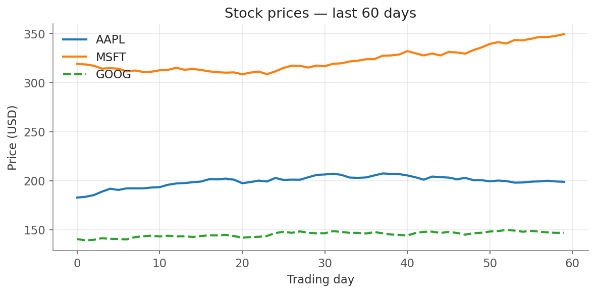
Three time series on one Axes — distinct colour and linestyle so GOOG survives a grayscale printout.
Three series on one axes, each with a distinct color. The dashed linestyle on GOOG is a backup signal in case the plot is printed in black-and-white. Always assume someone, somewhere, will print your plot grayscale — encode the difference in shape and color.
Markers and linestyles — the cheat sheet
ax.plot(x, y,
        color="crimson",
        linestyle="--",      # '-', '--', '-.', ':'
        linewidth=2,
        marker="o",          # 'o', 's', '^', 'D', 'x', '*'
        markersize=6,
        label="series A")
A common shortcut packs all three into one string:
ax.plot(x, y, "o--r") # red dashed line with circle markersReadable, but get out of the habit — explicit kwargs are easier to modify later.
Scatter — users by tenure vs revenue
This is where scatter shines: each row of your data is one point, and you can encode up to four dimensions in a single scatter (x, y, color, size). When size encodes a third variable the result is called a bubble plot.
import numpy as np
import matplotlib.pyplot as plt

# Simulated customer data: 200 users
np.random.seed(42)
n = 200
tenure_months = np.random.exponential(8, n).clip(1, 36)
revenue = 50 + tenure_months * 18 + np.random.normal(0, 80, n)
revenue = revenue.clip(20, None)
# A categorical plan: 0 = Free, 1 = Pro, 2 = Enterprise
plan = np.random.choice([0, 1, 2], size=n, p=[0.5, 0.35, 0.15])
# Number of seats — used for marker size
seats = np.where(plan == 0, 1, np.where(plan == 1, 5, 25))
seats = seats + np.random.randint(0, 5, n)

fig, ax = plt.subplots(figsize=(8, 5))

colors = np.array(["#888888", "#1f77b4", "#d62728"])
labels = ["Free", "Pro", "Enterprise"]

for k in [0, 1, 2]:
    mask = plan == k
    ax.scatter(tenure_months[mask], revenue[mask],
               s=seats[mask] * 6,           # size encodes seats
               c=colors[k],
               alpha=0.55,
               edgecolors="white", linewidth=0.5,
               label=labels[k])

ax.set_xlabel("Tenure (months)")
ax.set_ylabel("Monthly revenue (USD)")
ax.set_title("Revenue by tenure — bubble size = seat count")
ax.legend(title="Plan", loc="upper left", frameon=False)
ax.grid(True, alpha=0.3)

fig.tight_layout()
plt.show()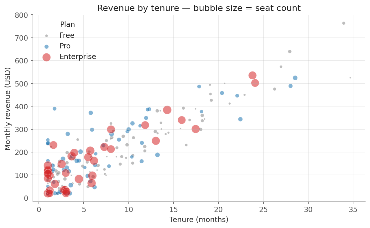
One scatter, four dimensions: tenure (x), revenue (y), plan (colour), seats (bubble size). Enterprise accounts are the big red bubbles.
Four dimensions on a 2D plot:
- x = tenure
- y = revenue
- color = plan tier (a category)
- size = seat count (a quantity)
The alpha=0.55 is critical — without it, dense regions become
opaque blobs and you can’t see overlap. The white edgecolors give
each marker a tiny outline so they don’t visually merge into each
other in clusters.
Line vs scatter — picking the right one
| Situation | Use |
|---|---|
| Time series (price over days, loss over steps) | ax.plot |
| Sensor readings indexed by depth/position | ax.plot |
| Two features across many samples | ax.scatter |
| Model predicted vs actual | ax.scatter |
| Tiny dataset (≤30 points) of x→y | Both — try each |
If you can’t decide, ask: does the order of points matter? If yes (today comes after yesterday), line. If no (these are 1000 independent customers), scatter.
In one breath
Two workhorse plots, split by one question — does the order of points matter? If yes (time, epoch,
depth), use ax.plot, which connects points in sequence; if no (independent observations), use
ax.scatter, where each point stands alone. ax.plot on unordered data produces a meaningless
“spaghetti” tangle. For multiple line series, vary linestyle as well as colour so the chart survives
a grayscale print or a colour-blind reader. Scatter’s superpower is dimensionality: x, y, colour
(category), and size (s, in area not radius) pack four variables into one plot — a bubble plot —
and alpha plus white edge-colours keep dense regions from collapsing into a blob.
Practice
Quick check
age and lifetime_value. Which plot?s argument in ax.scatter control?A question to carry forward
Look back at the stock chart: we stacked three series onto one Axes, and it worked because three lines share a scale and don’t overlap much. But recall the warning from the very first lesson — twelve countries on one line chart is spaghetti. Sometimes one Axes genuinely isn’t enough: you want each series on its own little chart, all sharing the same scales so the eye can compare them at a glance.
So the question to carry forward is: how do you put many Axes inside one Figure, laid out in a grid and
aligned? That’s the small multiples idea made real. The next lesson, subplots and GridSpec, shows
how plt.subplots(rows, cols) builds that grid, how to share axes across panels, and how GridSpec lets
you break out of a rigid grid when one panel needs to be bigger than the rest.
Practice this in an interview
All questionsA correlation heatmap encodes the pairwise Pearson or Spearman correlation coefficients of a numeric feature matrix as a color grid, making it fast to spot highly correlated feature pairs. Its limitations are that it shows only linear (or rank) association, hides nonlinear structure, and becomes unreadable past roughly 20 features.
A log scale is appropriate when data spans multiple orders of magnitude, when multiplicative growth is the natural frame of reference, or when you want to compare percentage change rather than absolute change. On a log scale, equal visual distances represent equal ratios, not equal differences.
Match the chart to the relationship in the data: comparison across categories calls for bars, trends over continuous time call for lines, correlation between two numeric variables calls for a scatter plot, and distribution shape calls for a histogram or box plot. The question you are answering — not aesthetics — drives the choice.
Small multiples (also called trellis or facet charts) repeat the same chart structure across panels, one per category, using identical scales, axes, and visual encodings. They let viewers compare patterns across groups without the visual tangle of many overlapping lines or bars, and are the right choice when you have more than three to four groups or when overlap obscures individual trends.