Seaborn — heatmaps and pairplots
Correlation matrices, pairwise scatter grids, and clustered heatmaps. The EDA plots that catch nonlinear relationships before you model.
Written and reviewed by Shreyash Prashu Last reviewed
What you'll learn
-
heatmapwith annotations and the right colormap for the data type - Correlation matrices — and why you mask the upper triangle
-
pairplotfor all-pairs scatters during EDA -
clustermapfor grouping rows and columns by similarity
Before you start
The last lesson hit a wall: bars and points compare a statistic across one categorical axis. They drown when you have a whole matrix — twelve features and every pairwise correlation, or two categoricals crossed into a grid of values.
The fix is to encode magnitude as colour so an entire matrix reads in one glance. That’s the heatmap, and its companion the pairplot.
Heatmaps and pairplots are the EDA power-tools. One shows you every pairwise relationship in your features. The other turns a matrix into a picture your eye can scan in two seconds. Together, they catch most of the things that would otherwise blow up later in a model.
heatmap — a matrix as colors
Anytime you have a 2D numeric matrix, heatmap is the move. The
classic application is a correlation matrix.
import numpy as np
import pandas as pd
import seaborn as sns
import matplotlib.pyplot as plt

sns.set_theme(style="white")

# Fake 8-feature dataset with some real correlations baked in
rng = np.random.default_rng(0)
n = 400
age          = rng.normal(35, 10, n)
tenure       = age - 18 + rng.normal(0, 3, n)            # correlated with age
salary       = 30 + tenure * 2.5 + rng.normal(0, 8, n)   # correlated with tenure
spend        = salary * 0.3 + rng.normal(0, 5, n)        # correlated with salary
visits       = rng.poisson(20, n)
churn_score  = -spend * 0.05 + rng.normal(0, 1, n)       # anti-correlated with spend
satisfaction = -churn_score + rng.normal(0, 0.5, n)      # anti-correlated with churn
support_tix  = rng.poisson(2, n) + (churn_score > 0) * 3 # mildly tied to churn

df = pd.DataFrame({
    "age": age, "tenure": tenure, "salary": salary, "spend": spend,
    "visits": visits, "churn_score": churn_score,
    "satisfaction": satisfaction, "support_tix": support_tix,
})

corr = df.corr()

fig, ax = plt.subplots(figsize=(7, 6))
sns.heatmap(
    corr, annot=True, fmt=".2f",
    cmap="RdBu_r", vmin=-1, vmax=1, center=0,
    square=True, linewidths=0.5, cbar_kws={"shrink": 0.8},
    ax=ax,
)
ax.set_title("Correlation matrix — 8 features")
fig.tight_layout()
plt.show()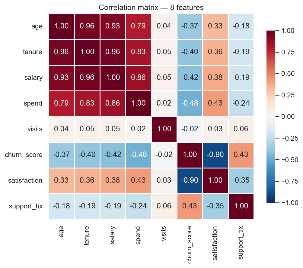
The whole 8×8 matrix in one glance — blue is positive, red negative, the number in every cell.
Three details that make the difference between a good heatmap and a bad one:
cmap="RdBu_r"withvmin=-1, vmax=1, center=0— correlations are diverging (negative to positive), so use a diverging colormap centered on zero.RdBu_rreads as “red = negative, blue = positive.”annot=True, fmt=".2f"— put the number in every cell. A heatmap without annotations is decoration, not data.square=True— square cells. The matrix is square so the plot should be too.
What the colormap lets you see
The same 6×6 correlation matrix, rendered with different colormaps. Switch between them — and toggle the mapping mode — to see how the choice changes what the reader can actually read.
Masking the upper triangle
A correlation matrix is symmetric, so half of it is redundant. Mask the upper triangle to declutter.
import numpy as np
import pandas as pd
import seaborn as sns
import matplotlib.pyplot as plt

sns.set_theme(style="white")
rng = np.random.default_rng(0)
n = 400
age          = rng.normal(35, 10, n)
tenure       = age - 18 + rng.normal(0, 3, n)
salary       = 30 + tenure * 2.5 + rng.normal(0, 8, n)
spend        = salary * 0.3 + rng.normal(0, 5, n)
visits       = rng.poisson(20, n)
churn_score  = -spend * 0.05 + rng.normal(0, 1, n)
satisfaction = -churn_score + rng.normal(0, 0.5, n)
support_tix  = rng.poisson(2, n) + (churn_score > 0) * 3
df = pd.DataFrame({"age": age, "tenure": tenure, "salary": salary, "spend": spend,
                   "visits": visits, "churn_score": churn_score,
                   "satisfaction": satisfaction, "support_tix": support_tix})

corr = df.corr()
mask = np.triu(np.ones_like(corr, dtype=bool), k=1)  # mask above the diagonal

fig, ax = plt.subplots(figsize=(7, 6))
sns.heatmap(
    corr, mask=mask, annot=True, fmt=".2f",
    cmap="RdBu_r", vmin=-1, vmax=1, center=0,
    square=True, linewidths=0.5, cbar_kws={"shrink": 0.8},
    ax=ax,
)
ax.set_title("Correlation matrix — lower triangle only")
fig.tight_layout()
plt.show()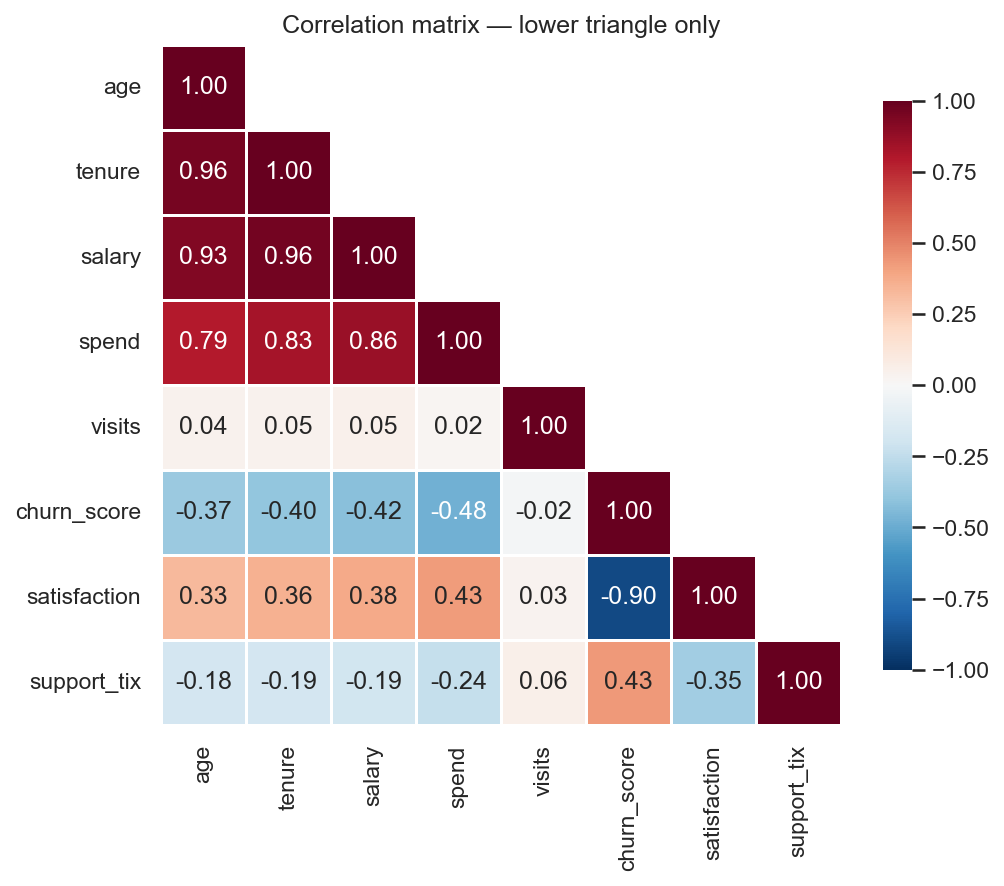
Same matrix, upper triangle masked — half the ink, all the information.
np.triu(..., k=1) builds a boolean mask of the strictly-upper
triangle. Half the ink, all the information.
pairplot — every scatter at once
Correlations only capture linear relationships. If your features
have nonlinear ties, the correlation matrix will lie to you.
pairplot draws a scatter for every feature pair, plus a distribution
on the diagonal. It’s the fastest way to find a U-shape, a bend, or a
cluster.
import numpy as np
import pandas as pd
import seaborn as sns
import matplotlib.pyplot as plt

sns.set_theme(style="whitegrid", palette="colorblind")
rng = np.random.default_rng(1)
n = 300

# Build a small set of features, including a nonlinear pair.
x1 = rng.normal(0, 1, n)
x2 = x1 ** 2 + rng.normal(0, 0.3, n)      # nonlinear in x1 — corr will say ~0
x3 = 0.7 * x1 + rng.normal(0, 0.4, n)     # linear in x1
x4 = rng.normal(0, 1, n)                  # noise

group = np.where(x1 > 0, "A", "B")
df = pd.DataFrame({"x1": x1, "x2": x2, "x3": x3, "x4": x4, "group": group})

print("Linear correlations:")
print(df[["x1", "x2", "x3", "x4"]].corr().round(2))

# Pairplot — diagonals show distributions, off-diagonals show scatters.
g = sns.pairplot(df, hue="group", diag_kind="kde",
                 plot_kws={"alpha": 0.5, "s": 18},
                 height=1.7)
g.figure.suptitle("All-pairs scatter — watch the (x1, x2) cell", y=1.02)
plt.show()
Linear correlations:
x1 x2 x3 x4
x1 1.00 -0.04 0.81 -0.02
x2 -0.04 1.00 -0.06 -0.04
x3 0.81 -0.06 1.00 -0.02
x4 -0.02 -0.04 -0.02 1.00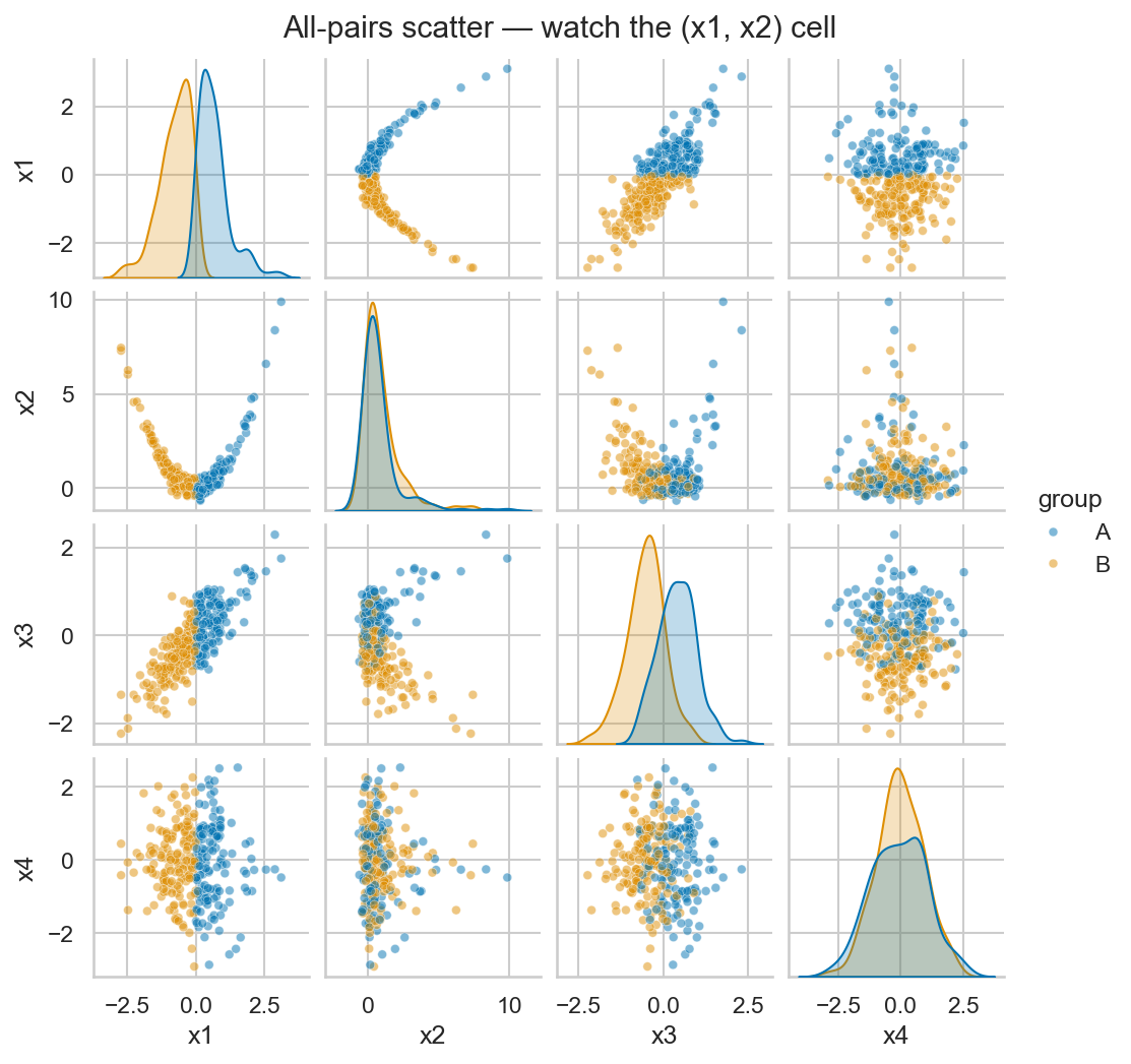
The correlation table calls (x1, x2) a flat −0.04 — but the pairplot cell is an unmistakable parabola.
Look at the correlation table first — corr(x1, x2) is just −0.04,
practically zero. But the scatter in the (x1, x2) cell of the pairplot is a clean
parabola.
That’s the whole point of pairplot: linear correlation can’t see
curvature, the scatter can. (Meanwhile corr(x1, x3) = 0.81 shows up
as the clean diagonal line it should.)
This is why you always pairplot a fresh dataset before fitting a linear model. It takes two seconds and saves you from regressions that miss the obvious nonlinear structure.
clustermap — heatmap + hierarchical clustering
clustermap is a heatmap that also reorders rows and columns so
similar ones sit next to each other. The dendrograms on the side show
the clustering structure.
import numpy as np
import pandas as pd
import seaborn as sns
import matplotlib.pyplot as plt

sns.set_theme(style="white")
rng = np.random.default_rng(2)

# 20 products x 10 weekly sales numbers. Two latent clusters of products.
n_products = 20
weeks = 10
cluster_a = rng.normal(100, 10, size=(10, weeks)) + np.linspace(0, 30, weeks)
cluster_b = rng.normal(60,  15, size=(10, weeks)) + np.linspace(0, -10, weeks)
sales = np.vstack([cluster_a, cluster_b])
np.random.shuffle(sales)   # mix the rows so the clustering has to find them

df = pd.DataFrame(sales,
                  index=[f"prod_{i}" for i in range(n_products)],
                  columns=[f"wk_{i+1}" for i in range(weeks)])

sns.clustermap(df, cmap="viridis", standard_scale=1,
               figsize=(7, 6), cbar_pos=(0.02, 0.83, 0.03, 0.15))
plt.show()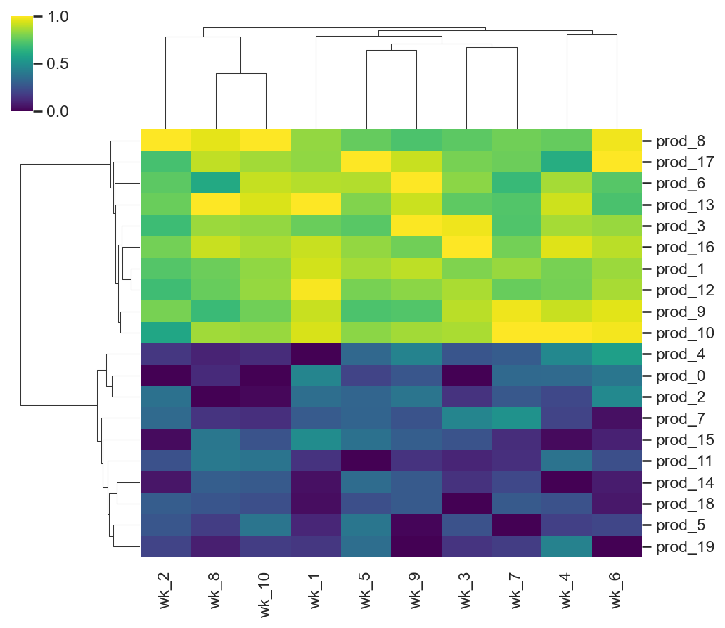
The row dendrogram recovers two product groups (growing vs shrinking) from shuffled rows — clustering done for you in one call.
standard_scale=1 rescales each column to the 0–1 range
(min becomes 0, max becomes 1). The cmap then reads relative
differences, not absolute magnitudes.
The row dendrogram shows two clear clusters — products that grew through the period vs ones that shrank — even though the rows were shuffled before plotting. That’s hierarchical clustering doing the work for you, visualized in one call.
In one breath
When the thing you’re showing is a matrix, encode magnitude as colour.
heatmap turns any 2D numeric grid — most often a df.corr()
correlation matrix — into a picture.
For that picture:
- Pick a diverging cmap centred at zero (
RdBu_r,vmin=-1, vmax=1) for signed data. - Pick a sequential one (
viridis,Blues) for magnitudes. Never use the lying rainbowjet. - Always use
annot=Trueso it’s data, not decoration. - Mask the redundant upper triangle of a symmetric matrix with
np.triu(..., k=1).
But correlation sees only linear ties. pairplot draws every
pairwise scatter, and a flat −0.04 correlation hid a clean parabola.
That makes it the mandatory two-second check before you fit a linear
model. clustermap reorders rows and columns by similarity, recovering
hidden groups with a dendrogram.
Practice
Quick check
corr(x1, x2) is ~0.02. Can you conclude x1 and x2 are unrelated?clustermap(..., standard_scale=1) do?A question to carry forward
That completes the toolkit. Across two chapters you’ve built every plot a data scientist reaches for — matplotlib’s hand-assembled charts and ML diagnostics, then seaborn’s one-line statistical graphics, all the way to whole-matrix heatmaps. You can now make anything.
But making a plot and making the right plot are different skills. Notice how often a choice was implied rather than reasoned: a heatmap for a matrix, a violin for shape, a bar for a comparison.
So the question to carry forward — and the pivot into the final chapter — is the one that turns a toolkit into a craft: given a dataset and a point to make, which chart actually answers your question, and which quietly misleads?
The next lesson, choosing the right chart, starts from the question instead of the gallery. It maps comparison, trend, distribution, relationship, and composition each to the encoding the human eye decodes most accurately. It shows exactly why a pie chart usually loses to a bar.
Practice this in an interview
All questionsA correlation heatmap encodes the pairwise Pearson or Spearman correlation coefficients of a numeric feature matrix as a color grid, making it fast to spot highly correlated feature pairs. Its limitations are that it shows only linear (or rank) association, hides nonlinear structure, and becomes unreadable past roughly 20 features.
Match the chart to the relationship in the data: comparison across categories calls for bars, trends over continuous time call for lines, correlation between two numeric variables calls for a scatter plot, and distribution shape calls for a histogram or box plot. The question you are answering — not aesthetics — drives the choice.
Pearson correlation measures the strength of the linear relationship between two continuous variables and is sensitive to outliers and non-normality. Spearman correlation is Pearson applied to the ranks of the data, making it appropriate for monotonic (not necessarily linear) relationships, ordinal variables, and data with outliers or heavy-tailed distributions.
t-SNE and UMAP are nonlinear dimensionality reduction algorithms designed primarily for 2D/3D visualization of high-dimensional data. Unlike PCA, they preserve local neighborhood structure rather than global variance, producing cleaner cluster separations in plots. Neither should be used as a preprocessing step for training a supervised model because they are transductive and their output is not stable across runs.