Seaborn — distributions
Statistical defaults that just work. histplot, kdeplot, displot, boxplot, violinplot — and the palette discipline that keeps your plots colorblind-safe.
Written and reviewed by Shreyash Prashu Last reviewed
What you'll learn
- When Seaborn beats raw matplotlib for distribution plots
-
histplot,kdeplot,displot— and which to reach for -
boxplotvsviolinplotfor comparing across categories - The
set_theme+ palette discipline (colorblind-safe by default)
Before you start
The last lesson left us building plots by hand — double for loops to annotate a confusion matrix,
manual styling on every default. That’s matplotlib’s bargain: total control, total assembly. Seaborn is
the answer to “what if one line gave me a statistically sensible plot?” — and this lesson cashes that in
for the most common question of all: how is this variable spread out?
Matplotlib is the engine. Seaborn is the part where you stop fiddling with bin counts and palette codes and start getting statistically sensible plots in one line. It’s built on matplotlib, so every Axes trick you already know still works.
The win is defaults. sns.histplot picks reasonable bins. sns.boxplot
draws whiskers, outliers, medians without you specifying anything.
sns.set_theme() swaps in palettes that are colorblind-safe and a
gridded style that reads well in reports.
Set the theme once, at the top
import numpy as np
import pandas as pd
import seaborn as sns
import matplotlib.pyplot as plt

# Do this once per notebook. "whitegrid" is the workhorse style;
# "colorblind" is a palette safe for the ~8% of viewers with CVD.
sns.set_theme(style="whitegrid", palette="colorblind")

# Simulated income samples from four countries (USD, log-normal)
rng = np.random.default_rng(0)
df = pd.DataFrame({
    "country": np.repeat(["US", "DE", "IN", "BR"], 500),
    "income":  np.concatenate([
        rng.lognormal(mean=10.8, sigma=0.7, size=500),  # US
        rng.lognormal(mean=10.6, sigma=0.6, size=500),  # DE
        rng.lognormal(mean=9.5,  sigma=0.8, size=500),  # IN
        rng.lognormal(mean=9.8,  sigma=0.9, size=500),  # BR
    ]),
})

print(df.groupby("country")["income"].median().round(0))
print("Total rows:", len(df))
country
BR 17014.0
DE 37967.0
IN 14756.0
US 47328.0
Name: income, dtype: float64
Total rows: 2000set_theme(style="whitegrid", palette="colorblind") is the one-line
discipline that buys you readable defaults everywhere downstream. Set
it at the top of every notebook. (The medians confirm the design — US
and DE are the high-income groups, IN and BR the lower — which is the
spread the plots below will make visible.)
histplot — the workhorse
import numpy as np
import pandas as pd
import seaborn as sns
import matplotlib.pyplot as plt

sns.set_theme(style="whitegrid", palette="colorblind")
rng = np.random.default_rng(0)
df = pd.DataFrame({
    "country": np.repeat(["US", "DE", "IN", "BR"], 500),
    "income":  np.concatenate([
        rng.lognormal(10.8, 0.7, 500),
        rng.lognormal(10.6, 0.6, 500),
        rng.lognormal(9.5,  0.8, 500),
        rng.lognormal(9.8,  0.9, 500),
    ]),
})

fig, ax = plt.subplots(figsize=(8, 4))
sns.histplot(
    data=df, x="income", hue="country",
    bins=40, log_scale=True,            # incomes are log-normal — show on log x
    element="step",                     # stacked outlines instead of bars
    stat="density", common_norm=False,  # each group sums to 1, independently
    ax=ax,
)
ax.set_title("Income distribution by country")
ax.set_xlabel("Annual income (USD, log scale)")
fig.tight_layout()
plt.show()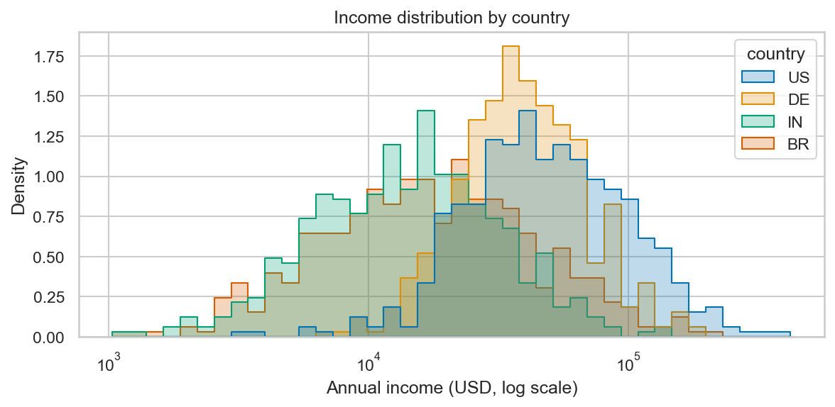
One call, four density-normalized step histograms on a log axis — US/DE shifted right, IN/BR left.
Three Seaborn-specific flags worth knowing:
log_scale=True— for skewed quantities like income or session duration, log axis is almost always the right call.stat="density"withcommon_norm=False— each group is normalized independently, so groups of different sizes are comparable.element="step"— stacked outlines instead of overlapping bars. Much easier to read when comparing distributions.
kdeplot — when you want a smooth curve
A kernel density estimate is a smoothed histogram. Use it when you care about the shape of the distribution and not exact counts.
import numpy as np
import pandas as pd
import seaborn as sns
import matplotlib.pyplot as plt

sns.set_theme(style="whitegrid", palette="colorblind")
rng = np.random.default_rng(1)
df = pd.DataFrame({
    "country": np.repeat(["US", "DE", "IN", "BR"], 500),
    "income":  np.concatenate([
        rng.lognormal(10.8, 0.7, 500),
        rng.lognormal(10.6, 0.6, 500),
        rng.lognormal(9.5,  0.8, 500),
        rng.lognormal(9.8,  0.9, 500),
    ]),
})

fig, ax = plt.subplots(figsize=(8, 4))
sns.kdeplot(
    data=df, x="income", hue="country",
    log_scale=True, fill=True, alpha=0.25,
    common_norm=False, ax=ax,
)
ax.set_title("Income KDE by country")
ax.set_xlabel("Annual income (USD, log scale)")
fig.tight_layout()
plt.show()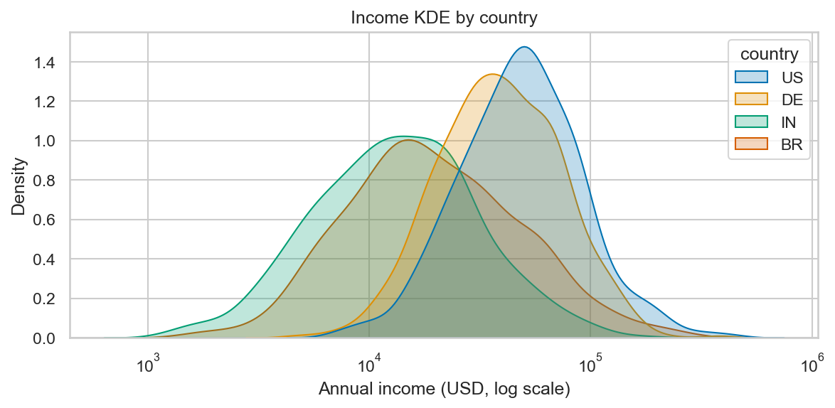
The same four distributions as smooth KDE curves — fill=True, alpha=0.25 lets them overlap and stay legible.
fill=True, alpha=0.25 is the standard look — the curves overlap
visibly, the eye reads them as distinct distributions. KDE has one trap: the smoothness is controlled by a bandwidth
(the spread of the kernel placed at each data point — larger = smoother),
and if you set it wrong, you can hide real bumps or invent fake ones.
Stick with the default bw_adjust=1 unless you have a reason.
displot — the figure-level shortcut
displot (with one l, “distribution plot”) is the figure-level
combination: it picks the right axes layout for you and supports
faceting in one argument.
import numpy as np
import pandas as pd
import seaborn as sns
import matplotlib.pyplot as plt

sns.set_theme(style="whitegrid", palette="colorblind")
rng = np.random.default_rng(2)
df = pd.DataFrame({
    "country": np.repeat(["US", "DE", "IN", "BR"], 500),
    "income":  np.concatenate([
        rng.lognormal(10.8, 0.7, 500),
        rng.lognormal(10.6, 0.6, 500),
        rng.lognormal(9.5,  0.8, 500),
        rng.lognormal(9.8,  0.9, 500),
    ]),
})

# One panel per country — small multiples in one line.
g = sns.displot(
    data=df, x="income", col="country", col_wrap=2,
    kind="hist", bins=30, log_scale=True,
    height=2.8, aspect=1.4,
)
g.set_titles("{col_name}")
g.set_axis_labels("Annual income (USD, log scale)", "Count")
plt.show()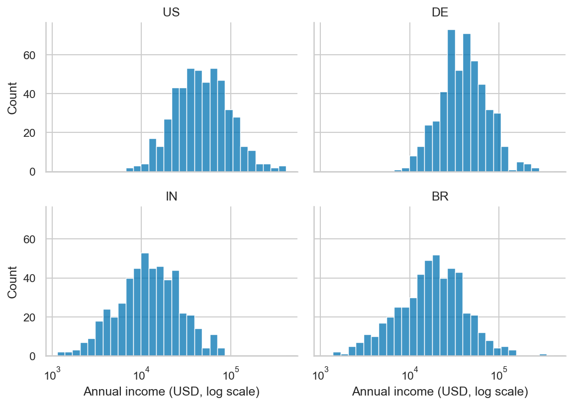
col=“country”, col_wrap=2 — small multiples in one argument, returned as a FacetGrid.
col="country", col_wrap=2 is the small-multiples trick from the
why-viz lesson, done in one argument. The return value is a
FacetGrid (Seaborn’s own multi-panel figure manager) — call methods
on it, not on a single Axes.
boxplot and violinplot — comparing across categories
When you have a continuous variable and want to compare its distribution across categories, these two cover almost every case.
import numpy as np
import pandas as pd
import seaborn as sns
import matplotlib.pyplot as plt

sns.set_theme(style="whitegrid", palette="colorblind")
rng = np.random.default_rng(3)
df = pd.DataFrame({
    "country": np.repeat(["US", "DE", "IN", "BR"], 500),
    "income":  np.concatenate([
        rng.lognormal(10.8, 0.7, 500),
        rng.lognormal(10.6, 0.6, 500),
        rng.lognormal(9.5,  0.8, 500),
        rng.lognormal(9.8,  0.9, 500),
    ]),
})

fig, (ax1, ax2) = plt.subplots(1, 2, figsize=(11, 4.5), sharey=True)

sns.boxplot(data=df, x="country", y="income", ax=ax1)
ax1.set_yscale("log")
ax1.set_title("Boxplot — quartiles + outliers")

sns.violinplot(data=df, x="country", y="income", ax=ax2,
               inner="quartile", cut=0)
ax2.set_yscale("log")
ax2.set_title("Violinplot — full density shape")

fig.tight_layout()
plt.show()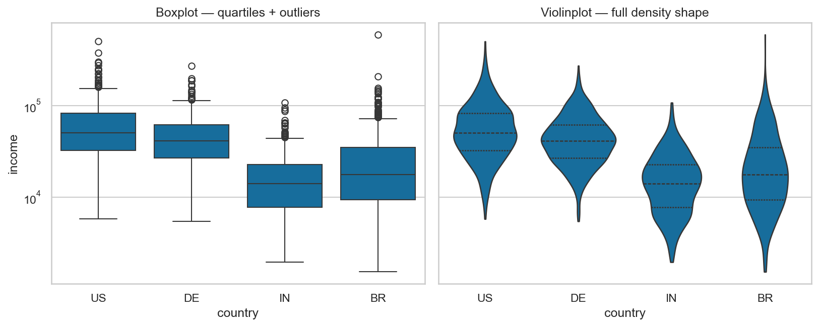
Same four groups, two summaries: the boxplot gives quartiles + outliers; the violin gives the full density shape.
Boxplot vs violinplot — when each wins:
- Boxplot — summary you trust (median, IQR, whiskers, outliers). Reads fast. Use for executive summaries and any plot where many categories share an axis.
- Violinplot — full shape of the distribution. Use when shape matters — e.g., is the distribution bimodal, skewed, fat-tailed? A boxplot would miss two clear peaks that a violin shows immediately.
Both lose to a histogram when you only have one category. Reach for them specifically when you’re comparing across categories.
In one breath
Seaborn trades matplotlib’s manual assembly for statistical defaults in one line. Set the tone once with
sns.set_theme(style="whitegrid", palette="colorblind") — colorblind for categories, viridis/mako for
sequential, vlag for diverging, never the rainbow jet. For one variable: histplot (use log_scale=True
for skewed data, stat="density", common_norm=False so unequal groups compare, element="step" to read
overlaps), or kdeplot for a smooth curve when shape matters more than counts. displot is the
figure-level shortcut — col="country", col_wrap=2 gives small multiples in one argument, returning a
FacetGrid. To compare a distribution across categories, boxplot for a fast trustworthy summary and
violinplot when the shape (bimodal, skew) is the story a box would hide.
Practice
Quick check
sns.set_theme(palette='colorblind') doing?A question to carry forward
Notice what every plot in this lesson asked: how is one continuous variable spread out? Income, latency — a single number, sliced by group. But a huge share of real questions flip that around. You don’t want the spread of conversion; you want its mean per experiment arm, with error bars. You don’t want a distribution of plans; you want the count of customers in each. The variable of interest is a single summary, and the x-axis is the category.
So the question to carry forward is: when the thing you’re comparing across categories is a statistic —
a mean, a count, a rate — rather than a full distribution, which plot computes it for you? The next lesson,
categorical plots, covers barplot (means with bootstrap confidence intervals, free), countplot,
pointplot for spotting interactions, and swarmplot for showing every point — with a decision tree for
picking the right one.
Practice this in an interview
All questionsA bar chart displays counts or aggregates for distinct categories separated by gaps; a histogram displays the distribution of a single continuous variable by dividing it into adjacent bins with no gap; a KDE (kernel density estimate) plot is a smoothed, continuous approximation of the same distribution without requiring a bin-width choice.
Choose the palette from the data's meaning first: sequential for ordered magnitude, diverging around a meaningful midpoint, and qualitative for unordered categories. Avoid red-green as the only cue, test contrast and color-vision simulations, and add labels, shapes, line styles, or position so color is never required to decode the chart.
Match the chart to the relationship in the data: comparison across categories calls for bars, trends over continuous time call for lines, correlation between two numeric variables calls for a scatter plot, and distribution shape calls for a histogram or box plot. The question you are answering — not aesthetics — drives the choice.
Skewness measures the asymmetry of a distribution's tails — positive skew means a longer right tail, negative skew a longer left tail. Kurtosis measures the heaviness of the tails relative to a normal distribution; excess kurtosis above zero indicates more probability mass in the tails and peak than a Gaussian, which matters for risk and outlier frequency.