Seaborn — categorical plots
barplot, countplot, pointplot, swarmplot — what Seaborn computes for you, and which plot beats the others in each situation.
Written and reviewed by Shreyash Prashu Last reviewed
What you'll learn
-
barplotwith the confidence intervals Seaborn computes by default -
countplotfor categorical counts (it's just a barplot withcountbaked in) -
pointplotfor comparing means across two categorical axes -
swarmplotwhen every individual data point matters - The decision tree for picking one over the others
Before you start
The last lesson showed the spread of one variable. This one answers the flip side: when what you want across categories is a single statistic — a mean, a count, a rate — which plot computes it for you and draws the uncertainty without a line of stats code?
You’ve got a categorical x-axis — plan tier, experiment arm, country — and you want to compare a number across it. Five plots cover almost every variant of this. Each one computes something different under the hood, and that’s exactly why picking the right one matters.
barplot — means with confidence intervals (the default)
The most-used categorical plot. Pass x (category) and y (continuous), and Seaborn computes the mean per category with bootstrap 95% confidence intervals drawn as error bars. You did not have to calculate either.
import numpy as np
import pandas as pd
import seaborn as sns
import matplotlib.pyplot as plt

sns.set_theme(style="whitegrid", palette="colorblind")

# Mock A/B/C test — three arms, conversion rate per user
rng = np.random.default_rng(0)
arms = []
for arm, p in [("control", 0.085), ("variant_A", 0.102), ("variant_B", 0.094)]:
    convs = rng.binomial(1, p, size=4000)
    arms.append(pd.DataFrame({"arm": arm, "converted": convs}))
df = pd.concat(arms, ignore_index=True)

print(df.groupby("arm")["converted"].mean().round(4))

fig, ax = plt.subplots(figsize=(7, 4))
sns.barplot(data=df, x="arm", y="converted", errorbar=("ci", 95), ax=ax)
ax.set_ylabel("Conversion rate")
ax.set_title("A/B/C test — mean conversion + 95% CI")
fig.tight_layout()
plt.show()
arm
control 0.0802
variant_A 0.1022
variant_B 0.0948
Name: converted, dtype: float64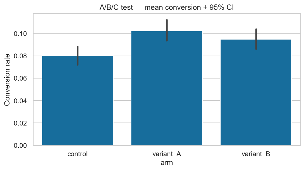
One call: mean conversion per arm with 95% bootstrap CIs. variant_A (0.102) leads control (0.080); read the error bars before believing it.
Three things Seaborn just did for you:
- Computed the mean of
convertedperarm(which is the conversion rate — mean of a 0/1 variable). - Bootstrapped (randomly resampled with replacement) the data 1 000 times by default to get a 95% confidence interval.
- Drew them as error bars on top of the bars.
Without Seaborn, that’s groupby + statsmodels + several lines of matplotlib. With it, it’s one line.
errorbar — what to pass
Seaborn changed the API around this — modern Seaborn uses errorbar=:
sns.barplot(..., errorbar=("ci", 95))      # 95% bootstrap CI (default style)
sns.barplot(..., errorbar="sd")            # one standard deviation
sns.barplot(..., errorbar=("se", 1.96))    # 1.96 * standard error ≈ 95%
sns.barplot(..., errorbar=None)            # no error bars at all
Always state what your error bars mean in the figure caption. “Error bars are 95% bootstrap CI” is a one-line trust signal.
countplot — frequency of a category
When your y-axis is literally “count of rows,” reach for countplot. It’s a barplot with count baked in, so you only pass x (or y for horizontal bars).
import numpy as np
import pandas as pd
import seaborn as sns
import matplotlib.pyplot as plt

sns.set_theme(style="whitegrid", palette="colorblind")
rng = np.random.default_rng(0)
df = pd.DataFrame({
    "plan": rng.choice(["Free", "Pro", "Business", "Enterprise"],
                       size=1500, p=[0.55, 0.28, 0.12, 0.05]),
    "region": rng.choice(["NA", "EU", "APAC"], size=1500, p=[0.5, 0.3, 0.2]),
})

fig, ax = plt.subplots(figsize=(8, 4))
sns.countplot(data=df, y="plan", hue="region",
              order=["Enterprise", "Business", "Pro", "Free"], ax=ax)
ax.set_title("Customers per plan, split by region")
ax.set_xlabel("Customer count")
fig.tight_layout()
plt.show()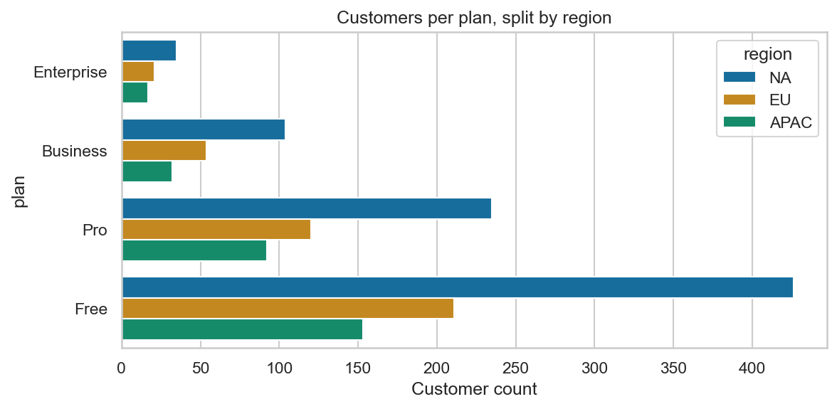
countplot with order= (not alphabetical) and hue=“region” — a grouped bar chart for free.
Two patterns to internalize:
order=lets you control category order explicitly (don’t trust default alphabetical).hue=(maps a second categorical variable to color) adds a second split.
Combined, you get a grouped bar chart for free.
pointplot — means as points with error bars
pointplot shows the same statistic as barplot (mean + CI) but as points connected by a line. Useful when you have two categorical axes and want to see the interaction.
import numpy as np
import pandas as pd
import seaborn as sns
import matplotlib.pyplot as plt

sns.set_theme(style="whitegrid", palette="colorblind")

# Same A/B test, but split by region — does the lift vary?
rng = np.random.default_rng(1)
rows = []
base = {"control": 0.085, "variant_A": 0.102, "variant_B": 0.094}
region_mult = {"NA": 1.0, "EU": 1.1, "APAC": 0.9}
for arm, p in base.items():
    for region, mult in region_mult.items():
        convs = rng.binomial(1, p * mult, size=1500)
        for c in convs:
            rows.append((arm, region, c))
df = pd.DataFrame(rows, columns=["arm", "region", "converted"])

fig, ax = plt.subplots(figsize=(7.5, 4.5))
sns.pointplot(data=df, x="arm", y="converted", hue="region",
              errorbar=("ci", 95), dodge=0.25, ax=ax)
ax.set_ylabel("Conversion rate")
ax.set_title("A/B/C test — does the lift vary by region?")
fig.tight_layout()
plt.show()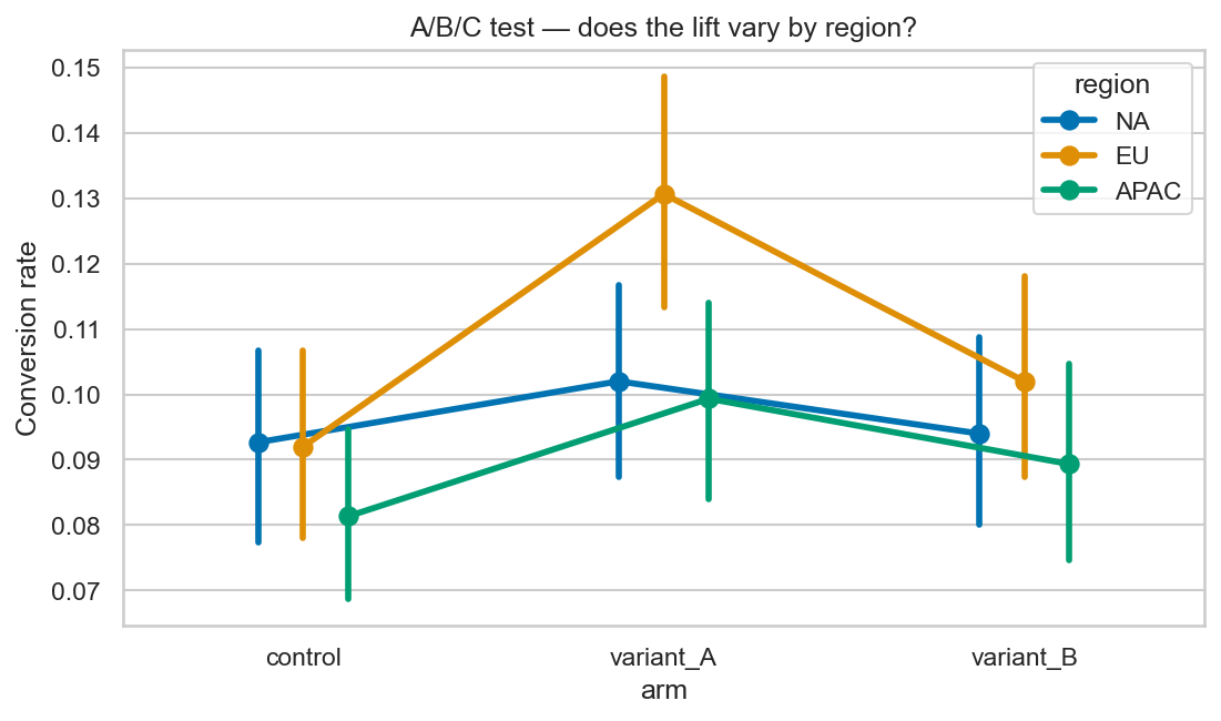
pointplot with a hue — connected means across two categorical axes make an interaction (or its absence) jump out.
The lines connecting points across arms make it easy to see whether the pattern changes by region — that’s an interaction effect (when the impact of one variable depends on the level of another).
dodge=0.25 nudges the three region series apart horizontally so their error bars don’t overlap.
swarmplot — every observation, no overlap
When you have a small-to-medium sample (say, 30 to a few hundred per category), nothing beats showing every point. swarmplot does that without stacking dots — it nudges them sideways to keep them visible.
import numpy as np
import pandas as pd
import seaborn as sns
import matplotlib.pyplot as plt

sns.set_theme(style="whitegrid", palette="colorblind")
rng = np.random.default_rng(2)

# Latency numbers from three deployment configs, 60 requests each
df = pd.DataFrame({
    "config": np.repeat(["baseline", "tuned", "tuned+cache"], 60),
    "latency_ms": np.concatenate([
        rng.normal(180, 25, 60),
        rng.normal(150, 22, 60),
        rng.normal(110, 18, 60),
    ]),
})

fig, ax = plt.subplots(figsize=(7, 4.5))
sns.boxplot(data=df, x="config", y="latency_ms",
            color="white", showfliers=False, width=0.4, ax=ax)
sns.swarmplot(data=df, x="config", y="latency_ms",
              size=4, ax=ax)
ax.set_ylabel("Latency (ms)")
ax.set_title("Request latency by config — boxplot + swarmplot overlay")
fig.tight_layout()
plt.show()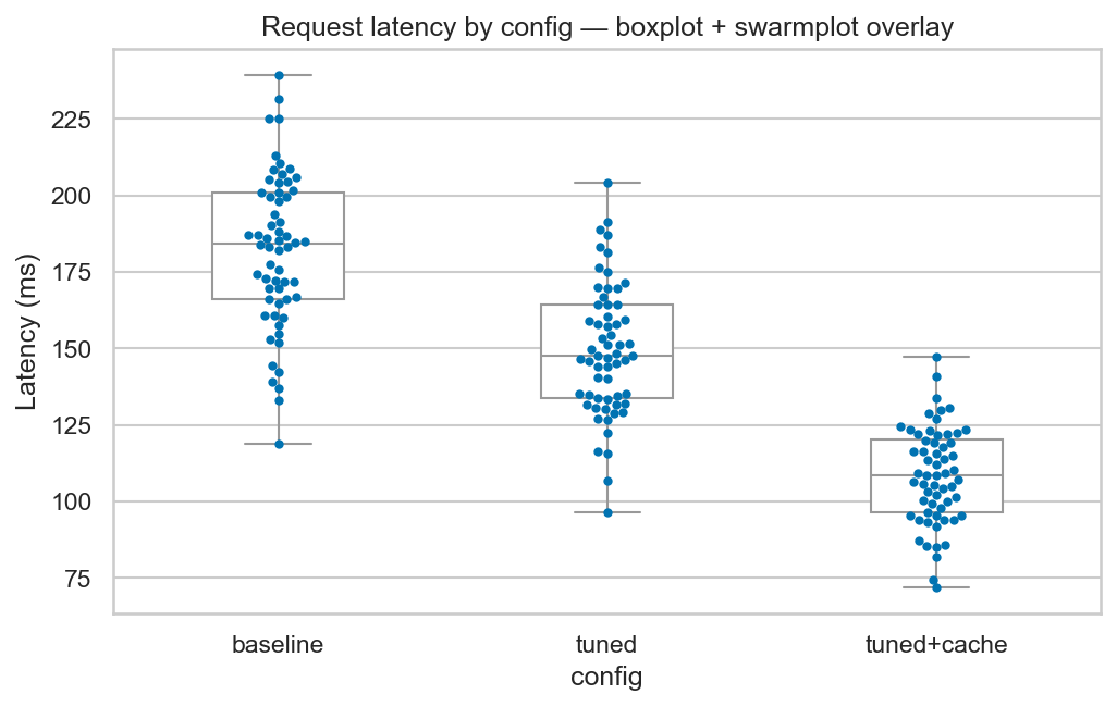
Boxplot summary + swarm of every point — the “trust me, nothing’s hidden” chart for small experiments.
The boxplot gives you the summary; the swarm gives you the actual data. This is the gold-standard “trust me” chart for small experiments — nothing is hidden, the outliers are visible, the median is visible.
For larger samples (n > 500 per category), swarmplot gets unhappy because it can’t fit all the dots. Use stripplot (no nudging, just jitter) or fall back to violin/box.
Decision tree
| Question | Plot |
|---|---|
| Mean per category, with uncertainty | barplot |
| Counts of each category | countplot |
| Mean per category, two categorical axes (look for interactions) | pointplot |
| Show every single observation, small/medium n | swarmplot |
| Compare full distribution shape across categories | violinplot |
| Compare summary distribution (quartiles, outliers) across categories | boxplot |
Same data, five views — which one hides the story?
In one breath
When you compare a statistic across categories, Seaborn computes it for you.
barplot(x, y)draws the mean per category with a 95% bootstrap CI as error bars. For a 0/1 column, that mean is the conversion rate, all in one line. State what the error bars mean viaerrorbar=.countplotis a barplot withcountbaked in. Passorder=(never trust alphabetical) andhue=for a grouped chart.pointplotshows the same mean+CI as connected points. It’s ideal for spotting an interaction across two categorical axes;dodge=separates the series.swarmplotshows every observation without overlap — the honest small-experiment chart. Switch tostripplotor a violin past a few hundred points per category.
Read the error bars before believing any gap.
Practice
Quick check
sns.barplot(data=df, x='arm', y='converted') on a 0/1 outcome with no other arguments. What does the bar height represent?swarmplot stop working well?A question to carry forward
Look at the pointplot — we crossed two categorical axes (arm × region) and read off whether the pattern held. That worked for three arms and three regions.
But what if you had twelve features and wanted every pairwise correlation, or a dense grid of values where colour, not bar height, has to carry the number? Bars and points would drown.
So the question to carry forward is: how do you visualise a whole matrix at once — a correlation table, a confusion matrix, two categoricals crossed into a grid of values?
The next lesson, heatmaps and pairplot, encodes magnitude as colour so an entire matrix reads in one glance. pairplot plots every variable against every other in a single command — the fastest first look at an unfamiliar dataset.
Practice this in an interview
All questionsA bar chart displays counts or aggregates for distinct categories separated by gaps; a histogram displays the distribution of a single continuous variable by dividing it into adjacent bins with no gap; a KDE (kernel density estimate) plot is a smoothed, continuous approximation of the same distribution without requiring a bin-width choice.
Match the chart to the relationship in the data: comparison across categories calls for bars, trends over continuous time call for lines, correlation between two numeric variables calls for a scatter plot, and distribution shape calls for a histogram or box plot. The question you are answering — not aesthetics — drives the choice.
Pie charts work only when you have two to three parts whose proportions differ substantially and sum to a meaningful whole. Beyond that, humans compare angles and arc lengths poorly, making slices of similar size indistinguishable. A sorted bar chart almost always communicates the same information more accurately.
Parquet is a columnar, compressed format optimized for analytical reads — only the queried columns are scanned. Avro is row-oriented, schema-embedded, and optimized for write-heavy pipelines and Kafka serialization. CSV is human-readable but schema-less, uncompressed, and slow at scale — use it only at system boundaries where a downstream tool requires it.