Plots every ML engineer ships
The five charts that go on every model card — confusion matrix, ROC, precision-recall, learning curve, feature importance. Copy-paste ready.
Written and reviewed by Shreyash Prashu Last reviewed
What you'll learn
- Annotated confusion matrices that a non-ML stakeholder can read
- ROC and precision-recall curves with AUC in the legend
- Learning curves that diagnose overfitting at a glance
- Feature importance bar charts ranked correctly
Before you start
The dashboard from the last lesson was deliberately generic. This one is the opposite — the specific, non-negotiable charts a machine-learning model is judged by. A model is only as trustworthy as the plots that come with it. Every serious model card — internal review doc, customer-facing report, production runbook — needs roughly the same five charts. Learn them once, paste them everywhere.
The five are:
- confusion matrix
- ROC + AUC
- precision-recall
- learning curve
- feature importance
Together they answer:
- where does the model get things wrong
- how good is it at ranking
- how does it behave at imbalanced thresholds
- is it overfitting
- which features actually matter
Confusion matrix — annotated, not just colored
A confusion matrix without numbers in the cells is useless. Annotate it.
import numpy as np
import matplotlib.pyplot as plt

# Hand-rolled predictions vs labels — 4-class problem
classes = ["spam", "promo", "social", "primary"]
cm = np.array([
    [142,   8,   2,   3],
    [ 11, 118,   6,   9],
    [  4,   5, 167,  12],
    [  2,   7,  14, 190],
])

fig, ax = plt.subplots(figsize=(6, 5))
im = ax.imshow(cm, cmap="Blues")

# Tick labels
ax.set_xticks(range(len(classes)))
ax.set_yticks(range(len(classes)))
ax.set_xticklabels(classes)
ax.set_yticklabels(classes)
ax.set_xlabel("Predicted")
ax.set_ylabel("True")
ax.set_title("Confusion matrix — email classifier")

# Annotate each cell with the count.
# Flip text color on dark cells for legibility.
thresh = cm.max() / 2
for i in range(cm.shape[0]):
    for j in range(cm.shape[1]):
        ax.text(j, i, cm[i, j],
                ha="center", va="center",
                color="white" if cm[i, j] > thresh else "black")

fig.colorbar(im, ax=ax, fraction=0.046, pad=0.04)
fig.tight_layout()
plt.show()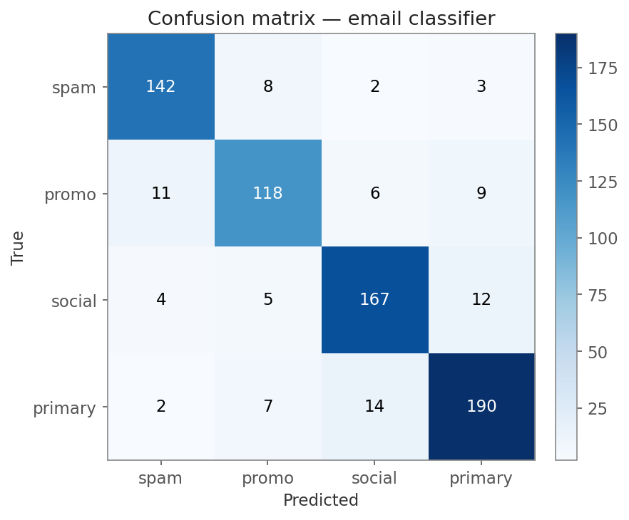
Rows = true label, columns = predicted. The bright diagonal is correct predictions; off-diagonal cells are the errors.
The layout convention: rows = true label, columns = predicted label. That means the diagonal (top-left to bottom-right) is correct predictions; everything else is an error.
Two non-negotiables: counts in every cell, and text colour that
flips on the dark cells so the numbers stay readable. The imshow
textloop is the whole pattern — sklearn’sConfusionMatrixDisplaydoes the same thing under the hood.
ROC curve with AUC
ROC (Receiver Operating Characteristic) plots true positive rate (fraction of real positives the model catches) vs false positive rate (fraction of negatives it wrongly flags) as you sweep the decision threshold. The AUC (Area Under the Curve) collapses this to one number you can quote in a Slack message — higher is better, 0.5 is random, 1.0 is perfect.
import numpy as np
import matplotlib.pyplot as plt

from sklearn.datasets import make_classification
from sklearn.linear_model import LogisticRegression
from sklearn.model_selection import train_test_split
from sklearn.metrics import roc_curve, auc

X, y = make_classification(n_samples=2000, n_features=20, n_informative=8,
                           weights=[0.7, 0.3], random_state=0)
X_tr, X_te, y_tr, y_te = train_test_split(X, y, test_size=0.3, random_state=0)

model = LogisticRegression(max_iter=1000).fit(X_tr, y_tr)
scores = model.predict_proba(X_te)[:, 1]

fpr, tpr, _ = roc_curve(y_te, scores)
roc_auc = auc(fpr, tpr)              # 0.951 on this split

fig, ax = plt.subplots(figsize=(6, 5))
ax.plot(fpr, tpr, color="steelblue", lw=2,
        label=f"Logistic — AUC = {roc_auc:.3f}")
ax.plot([0, 1], [0, 1], color="grey", lw=1, linestyle="--",
        label="Random")
ax.set_xlim(0, 1)
ax.set_ylim(0, 1.02)
ax.set_xlabel("False positive rate")
ax.set_ylabel("True positive rate")
ax.set_title("ROC curve")
ax.legend(loc="lower right", frameon=False)
ax.grid(True, alpha=0.3)
fig.tight_layout()
plt.show()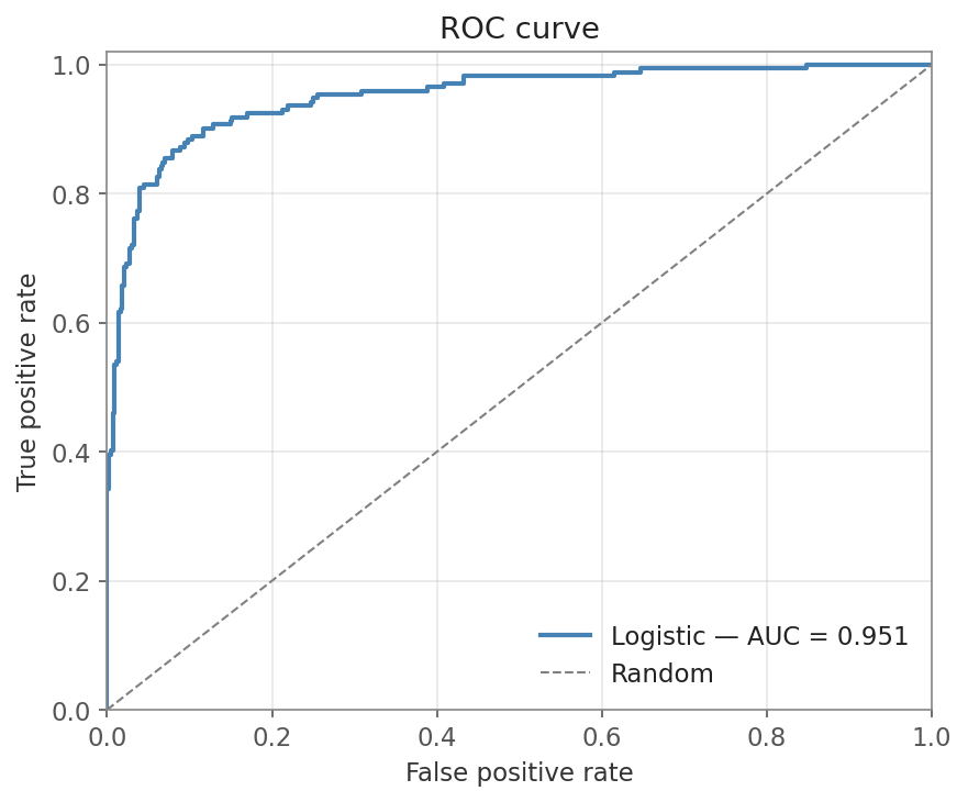
AUC = 0.951 — the curve bows hard toward the top-left, far above the dashed random baseline.
The dashed diagonal is the random-classifier baseline. The AUC goes right into the legend label — anyone scanning the plot sees the headline number without reading the title.
Precision-recall — the imbalanced-class workhorse
Precision = of all predicted positives, how many are actually positive. Recall = of all actual positives, how many did the model find. There is a trade-off: a stricter threshold raises precision but lowers recall.
When positives are rare (fraud, churn, click-through), ROC can look flatteringly good because the FPR stays tiny. Precision-recall is honest about how many of your positive predictions are correct.
import numpy as np
import matplotlib.pyplot as plt

from sklearn.datasets import make_classification
from sklearn.linear_model import LogisticRegression
from sklearn.model_selection import train_test_split
from sklearn.metrics import precision_recall_curve, average_precision_score

X, y = make_classification(n_samples=3000, n_features=15, n_informative=6,
                           weights=[0.95, 0.05], random_state=1)
X_tr, X_te, y_tr, y_te = train_test_split(X, y, test_size=0.3, random_state=0)

model = LogisticRegression(max_iter=1000).fit(X_tr, y_tr)
scores = model.predict_proba(X_te)[:, 1]

precision, recall, _ = precision_recall_curve(y_te, scores)
ap = average_precision_score(y_te, scores)   # 0.671 on this split
baseline = y_te.mean()    # precision of a random classifier = positive rate (0.053)

fig, ax = plt.subplots(figsize=(6, 5))
ax.plot(recall, precision, color="crimson", lw=2,
        label=f"Logistic — AP = {ap:.3f}")
ax.axhline(baseline, color="grey", lw=1, linestyle="--",
           label=f"Baseline = {baseline:.3f}")
ax.set_xlim(0, 1)
ax.set_ylim(0, 1.02)
ax.set_xlabel("Recall")
ax.set_ylabel("Precision")
ax.set_title("Precision-recall curve — 5% positive rate")
ax.legend(loc="upper right", frameon=False)
ax.grid(True, alpha=0.3)
fig.tight_layout()
plt.show()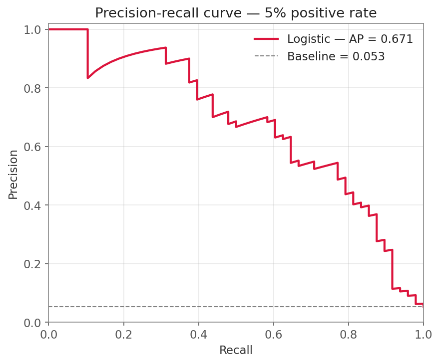
AP = 0.671, and the dashed baseline sits at just 0.053 (the 5% positive rate) — the gap is the lift the model actually earns.
The baseline for PR is not the diagonal — it’s a horizontal line at the positive rate. With 5% positives, random precision is 0.05, and a real model has to clear that. Always draw the baseline so reviewers can see how much lift you’ve actually got.
The confusion matrix and these two curves all move together as you shift the decision threshold. Drag it below to see exactly how that works with real sample counts:
One model score, infinite classifiers — move the threshold
Each dot is one sample. Positives (top row) and negatives (bottom row) are sorted by the model's probability score. The threshold line decides what counts as a positive prediction — drag it left and you catch more real positives (recall ↑, precision ↓); drag it right and you flag fewer false alarms (precision ↑, recall ↓).
Learning curve — train vs val loss
Two lines, x = epoch, y = loss. The shape tells you everything.
import numpy as np
import matplotlib.pyplot as plt

# Simulated training history — train loss keeps falling,
# val loss bottoms out then rises (classic overfit).
np.random.seed(0)
epochs = np.arange(1, 51)
train_loss = 1.6 * np.exp(-epochs / 12) + 0.05 + np.random.normal(0, 0.01, 50)
val_loss   = 1.6 * np.exp(-epochs / 12) + 0.15 + 0.004 * (epochs - 20).clip(0) ** 1.5

best_epoch = int(np.argmin(val_loss)) + 1   # 26

fig, ax = plt.subplots(figsize=(8, 4))
ax.plot(epochs, train_loss, label="Train loss", color="steelblue", lw=2)
ax.plot(epochs, val_loss,   label="Val loss",   color="crimson",   lw=2)

# Mark the best epoch
ax.axvline(best_epoch, color="grey", linestyle="--", lw=1)
ax.annotate(f"Best epoch = {best_epoch}",
            xy=(best_epoch, val_loss.min()),
            xytext=(best_epoch + 3, val_loss.min() + 0.15),
            arrowprops=dict(arrowstyle="->", color="black"))

ax.set_xlabel("Epoch")
ax.set_ylabel("Loss")
ax.set_title("Learning curve — train vs validation")
ax.legend(loc="upper right", frameon=False)
ax.grid(True, alpha=0.3)
fig.tight_layout()
plt.show()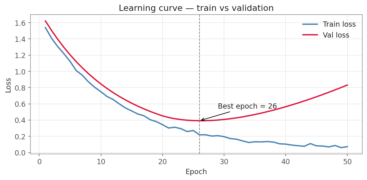
Val loss bottoms at epoch 26 then rises while train loss keeps falling — the textbook overfit fork. Early-stop at the dashed line.
The validation minimum lands at epoch 26 — after that, train loss keeps dropping while val loss climbs, the unmistakable fork of overfitting. Three patterns to recognize at a glance:
- Both curves still falling at the end → undertrained, train longer.
- Train falls, val flattens → fine, you’ve reached capacity.
- Train falls, val starts rising → overfit. Early-stop at the validation minimum (the vertical line above).
You can read all of these off the shape alone — no need for the underlying numbers. Flip between the canonical diagnoses below and drag the early-stop line to see where you’d halt each run.
Read the diagnosis off the shape — no data required
Feature importance — sorted, descending, with values
The bar chart that ends every model report. Two rules: sort the bars and show the magnitude in the label or at the bar end.
import numpy as np
import matplotlib.pyplot as plt

features = np.array(["account_age_days", "tx_count_30d", "avg_tx_amt",
                     "country_risk_score", "device_age_days", "ip_velocity",
                     "merchant_category_risk", "hour_of_day", "is_weekend",
                     "card_bin_risk"])
importance = np.array([0.21, 0.18, 0.14, 0.11, 0.08, 0.07, 0.06, 0.05, 0.05, 0.05])

# argsort is ascending; barh then draws the largest bar at the top
order = np.argsort(importance)
features_sorted   = features[order]
importance_sorted = importance[order]

fig, ax = plt.subplots(figsize=(8, 5))
bars = ax.barh(features_sorted, importance_sorted, color="steelblue")

# Value labels at the end of each bar
for bar, val in zip(bars, importance_sorted):
    ax.text(val + 0.003, bar.get_y() + bar.get_height() / 2,
            f"{val:.2f}", va="center", fontsize=9)

ax.set_xlabel("Importance")
ax.set_title("Feature importance — fraud model v3.1")
ax.set_xlim(0, importance.max() * 1.15)
ax.spines["top"].set_visible(False)
ax.spines["right"].set_visible(False)
fig.tight_layout()
plt.show()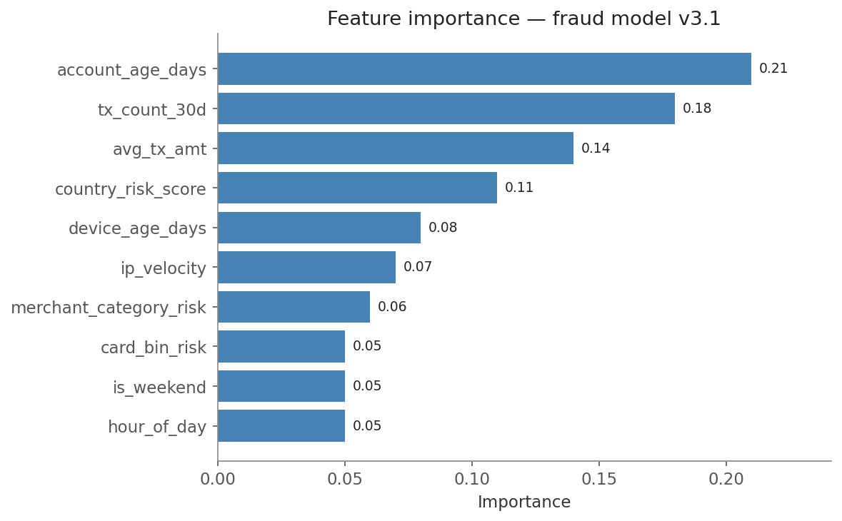
Sorted descending, horizontal bars, value at the end of each — account_age_days (0.21) leads.
Horizontal bars (barh) are nearly always better than vertical when
feature names are more than one short word — the labels stay
horizontal and readable. Sorted, with values printed, no gridlines
needed.
In one breath
Five charts ship with every model.
- A confusion matrix (rows = true, columns = predicted; diagonal = correct) needs counts in every cell and text colour that flips on dark cells.
- ROC + AUC sweeps the threshold to plot true-positive vs false-positive rate. It collapses it to one number (here 0.951; 0.5 is random). On rare positives it flatters.
- Reach for precision-recall instead. Its baseline is a horizontal line at the positive rate (0.053 here), not a diagonal.
- A learning curve diagnoses fit from shape alone:
- both falling = undertrained
- train-falls-val-flat = done
- train-falls-val-rises = overfit (early-stop at the val minimum, epoch 26)
- And feature importance is a horizontal bar chart, sorted descending with values printed.
Learn the five, paste them everywhere.
Practice
Quick check
A question to carry forward
Look back at the confusion matrix code. It includes:
- the double
forloop to write counts in cells - the manual text-colour flip
- the colorbar fiddling
Even our “simple” plots took a dozen lines of styling each, and every one started from a bare-bones default. That’s matplotlib’s bargain: total control, but you build everything by hand.
So the question to carry forward is: what if a single line gave you a statistically aware plot with:
- a histogram with a smooth density curve already overlaid
- sensible colours
- a legend
—with no manual loops at all? That’s the promise of the next chapter,
Seaborn, a library built on top of matplotlib for fast statistical
graphics. Its first lesson, distributions, shows how histplot,
kdeplot, and displot turn the “how is this variable spread out?”
question into one readable call.
Practice this in an interview
All questionsA model card documents a model's intended use, training data, evaluation results broken down by relevant subgroups, known limitations, and ethical considerations, so stakeholders can judge whether and where it should be used. Explainability is provided through methods like SHAP or LIME for feature attributions, plus logging the inputs and reasons behind each decision so it can be audited or contested. Together they support transparency, oversight, and regulatory requirements for high-risk systems.
A confusion matrix tallies predictions against ground truth in a 2x2 table: true positives, true negatives, false positives, and false negatives. From those four cells every classification metric — accuracy, precision, recall, F1, specificity — can be derived. It exposes which kind of error a model makes, not just how often it errs.
ML CI/CD must validate not just code correctness but also model quality — automated retraining triggers, data validation, model evaluation gates, and canary deployment checks that standard software pipelines have no equivalent for. A regression in model AUC is as much a deployment failure as a 500 error.
MAE, RMSE, MAPE, and R² each measure a different aspect of regression quality and each has a regime where it misleads. RMSE is dominated by outliers; MAE is robust but hides large-error tails; MAPE is undefined at zero and asymmetrically penalises under-prediction; R² can appear high even when absolute errors are large, and can be negative, yet is still commonly misread as a percentage-correct. Choosing the right metric requires knowing the cost structure of the prediction task.