Why you must visualize
Anscombe's quartet — four datasets with identical statistics and wildly different shapes. Plot first, model later.
Written and reviewed by Shreyash Prashu Last reviewed
What you'll learn
- Why summary statistics can lie to you
- The 3 audiences a plot serves — and the different bar for each
- The "small multiples" principle
Before you start
The Business Analytics section closed by promising a quiet shock: four datasets with identical statistics that look nothing alike. Here it is — and it is the single best argument for plotting before you trust anything.
You can fit a linear regression to a dataset, get a clean R² (the fraction of variance the line explains — 1.0 is a perfect fit) of 0.67, and have no idea that your data is a parabola, an outlier-driven line, or a vertical stripe. Four datasets can share every summary statistic you’d think to check — mean, variance, correlation, regression line — and still look completely different. This is Anscombe’s quartet, and it’s the single best argument for plotting before you trust anything.
Anscombe’s quartet — the reveal
import numpy as np
import matplotlib.pyplot as plt

# The four classic Anscombe datasets (1973)
x1 = np.array([10, 8, 13, 9, 11, 14, 6, 4, 12, 7, 5], dtype=float)
y1 = np.array([8.04, 6.95, 7.58, 8.81, 8.33, 9.96, 7.24, 4.26, 10.84, 4.82, 5.68])
y2 = np.array([9.14, 8.14, 8.74, 8.77, 9.26, 8.10, 6.13, 3.10, 9.13, 7.26, 4.74])
y3 = np.array([7.46, 6.77, 12.74, 7.11, 7.81, 8.84, 6.08, 5.39, 8.15, 6.42, 5.73])
x4 = np.array([8, 8, 8, 8, 8, 8, 8, 19, 8, 8, 8], dtype=float)
y4 = np.array([6.58, 5.76, 7.71, 8.84, 8.47, 7.04, 5.25, 12.50, 5.56, 7.91, 6.89])

datasets = [(x1, y1, "I"), (x1, y2, "II"), (x1, y3, "III"), (x4, y4, "IV")]

# Print the supposedly "identical" stats
for x, y, label in datasets:
    print(f"{label}: mean(x)={x.mean():.2f}  mean(y)={y.mean():.2f}  "
          f"var(x)={x.var(ddof=1):.2f}  corr={np.corrcoef(x,y)[0,1]:.2f}")

# Now plot all four
fig, axes = plt.subplots(2, 2, figsize=(8, 6), sharex=True, sharey=True)
for ax, (x, y, label) in zip(axes.flat, datasets):
    ax.scatter(x, y, color="steelblue")
    # Same regression line fits all four (slope~0.5, intercept~3)
    xs = np.linspace(3, 20, 50)
    ax.plot(xs, 3 + 0.5 * xs, color="crimson", lw=1)
    ax.set_title(f"Dataset {label}")
fig.suptitle("Anscombe's quartet — same stats, different worlds")
fig.tight_layout()
plt.show()
The printed statistics are eerily, exactly identical across all four:
I:   mean(x)=9.00  mean(y)=7.50  var(x)=11.00  corr=0.82
II:  mean(x)=9.00  mean(y)=7.50  var(x)=11.00  corr=0.82
III: mean(x)=9.00  mean(y)=7.50  var(x)=11.00  corr=0.82
IV:  mean(x)=9.00  mean(y)=7.50  var(x)=11.00  corr=0.82
But the plot tells four completely different stories:
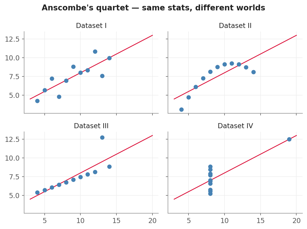
Same mean, variance, correlation, and regression line — four entirely different shapes.
Every dataset has the same mean, variance, and correlation. The same regression line goes through all four. But one is roughly linear, one is a clean parabola, one has a single outlier pulling a perfect line off, and one is a vertical strip plus a leverage point. A summary statistic collapses information. A plot preserves it.
The 3 audiences for any plot
When you make a plot, ask first: who’s going to look at this?
- Yourself, during exploration. Ugly is fine. Fast is everything. Default colors, no titles, ten plots in five minutes. The goal is to find something surprising before you commit to a story.
- Your team, during review. Clear axis labels, a title, legible legend. The plot has to defend a claim — “the model overfits after epoch 15” — and a colleague should be able to read it without a verbal explanation.
- Your stakeholders, in a report or dashboard. Now design matters. Consistent palette, callouts on the interesting bits, no jargon in the legend, no chartjunk. Often one or two plots that tell the whole story.
Don’t mix the bars. A messy exploratory plot in a board deck makes you look careless. A heavily-styled, annotated plot in a notebook wastes twenty minutes you should have spent making the next ten plots.
Small multiples
Look back at the Anscombe plot — four small panels, each with the same axes and scales. That’s a “small multiples” layout, and it’s one of the most powerful visualization patterns ever invented. The constant axes do the comparison for you: your eye instantly catches what differs between panels.
Use small multiples whenever you have a categorical dimension you’d otherwise stuff into colors. Twelve countries on one line chart is a spaghetti tangle. Twelve countries as twelve small line charts in a 4×3 grid is a story.
What you’re going to learn
The rest of this section moves from the absolute basics — figures and axes — through the workhorse plots (lines, scatters, subplots), into the ML-specific plots every model card needs, and finally into Seaborn for fast statistical graphics. By the end you’ll have a small kit of plots you can produce in under a minute apiece, and that’s most of the job.
In one breath
Summary statistics collapse information; a plot preserves it — Anscombe’s quartet proves four datasets can share an identical mean, variance, correlation, and regression line while being a line, a parabola, an outlier-bent fit, and a vertical stripe. So plot before you trust any number. Match the plot’s polish to its audience: ugly-and-fast for your own exploration, labelled-and-defensible for your team, designed-and-decluttered for stakeholders. And reach for small multiples — a grid of panels sharing the same axes — whenever you’d otherwise tangle a chart with many coloured lines; the constant scales do the comparison for your eye.
Practice
Quick check
A question to carry forward
We just leaned on a line of code without explaining it: fig, axes = plt.subplots(2, 2). It returned two things — a fig and a grid of axes — and every ax.scatter(...) afterward drew onto one of them. That pairing is not incidental; it is the entire mental model matplotlib is built on, and almost every confusing matplotlib error traces back to not having it straight.
So the question to carry forward is: what exactly are a Figure and an Axes, and why does every plot you’ll ever make start by getting hold of both? The next lesson, Figure & Axes, draws the one diagram that makes matplotlib finally click — the canvas, the plots that sit on it, and why plt.plot() quietly guessing which axes you meant is the source of so much grief.
Practice this in an interview
All questionsCoined by Edward Tufte, the data-ink ratio is the proportion of ink (or pixels) in a chart that encodes actual data, divided by the total ink used. Maximizing it means removing every element — gridlines, borders, tick marks, legends, decorative shading — that does not carry information the viewer cannot infer from the remaining ink.
Pie charts work only when you have two to three parts whose proportions differ substantially and sum to a meaningful whole. Beyond that, humans compare angles and arc lengths poorly, making slices of similar size indistinguishable. A sorted bar chart almost always communicates the same information more accurately.
A data story has three components: a clear narrative arc (situation, complication, resolution), charts that each advance one argument rather than display all available data, and deliberate attention direction through annotation, color emphasis, and sequencing. The goal is that a viewer reading only the titles and callouts should understand the conclusion without reading every axis.
Match the chart to the relationship in the data: comparison across categories calls for bars, trends over continuous time call for lines, correlation between two numeric variables calls for a scatter plot, and distribution shape calls for a histogram or box plot. The question you are answering — not aesthetics — drives the choice.