Subplots and layouts
Multiple panels in one figure. The grid, shared axes, layout managers, and GridSpec for the weird cases.
Written and reviewed by Shreyash Prashu Last reviewed
What you'll learn
-
plt.subplots(nrows, ncols)and indexing into the axes array - When and why to share axes
-
tight_layoutvsconstrained_layout - GridSpec for irregular grids
Before you start
The last lesson stacked three stock lines onto one Axes and flagged the limit: pile too much onto a single chart and it turns to spaghetti. The cure — the “small multiples” idea from the very first lesson — is to give each view its own little Axes, all in one Figure, sharing scales so the eye compares them at a glance. This lesson builds exactly that grid.
One plot is never enough. A real analysis ships with three to twelve views of the same data — a small dashboard. Matplotlib’s grid system handles this in one line.
The basic pattern
fig, axes = plt.subplots(nrows=2, ncols=3, figsize=(12, 6))
# axes is a 2D NumPy array of Axes — axes[0, 0], axes[1, 2], etc.
The return value is a tuple. The second element is an array of Axes when you have more than one. Three handy idioms:
fig, ax           = plt.subplots()                 # 1×1 → single Axes
fig, axes         = plt.subplots(1, 3)             # 1D array of length 3
fig, axes         = plt.subplots(2, 3)             # 2D array, shape (2, 3)
ax0, ax1, ax2     = plt.subplots(1, 3)[1]          # unpack 1D directly
for ax in axes.flat: ...                            # iterate in row-major
axes.flat is the cleanest way to loop over every subplot regardless
of the grid shape.
A 2×2 dashboard
Four views of a single customer dataset: distribution, scatter, time-series, and category breakdown.
import numpy as np
import matplotlib.pyplot as plt

np.random.seed(1)
n = 500
age = np.clip(np.random.normal(35, 10, n), 18, 70).astype(int)
spend = 20 + (age - 18) * 1.4 + np.random.normal(0, 12, n)
spend = spend.clip(5, None)
plan = np.random.choice(["Free", "Pro", "Enterprise"], n, p=[0.5, 0.35, 0.15])
months = np.arange(1, 13)
mrr = np.cumsum(np.random.normal(8, 2, 12)) + 50

fig, axes = plt.subplots(2, 2, figsize=(10, 7), constrained_layout=True)

# Top-left: distribution of age
axes[0, 0].hist(age, bins=20, color="steelblue", edgecolor="white")
axes[0, 0].set_title("Age distribution")
axes[0, 0].set_xlabel("Age")
axes[0, 0].set_ylabel("Count")

# Top-right: scatter of age vs spend
axes[0, 1].scatter(age, spend, alpha=0.4, s=18, color="darkorange")
axes[0, 1].set_title("Age vs monthly spend")
axes[0, 1].set_xlabel("Age")
axes[0, 1].set_ylabel("Spend (USD)")

# Bottom-left: MRR time-series
axes[1, 0].plot(months, mrr, marker="o", color="seagreen", linewidth=2)
axes[1, 0].set_title("MRR over 12 months")
axes[1, 0].set_xlabel("Month")
axes[1, 0].set_ylabel("MRR (k USD)")

# Bottom-right: bar of customers per plan
plans, counts = np.unique(plan, return_counts=True)
axes[1, 1].bar(plans, counts, color=["#888", "#1f77b4", "#d62728"])
axes[1, 1].set_title("Customers per plan")
axes[1, 1].set_ylabel("Count")

fig.suptitle("Customer dashboard — Q4 2025", fontsize=14)
plt.show()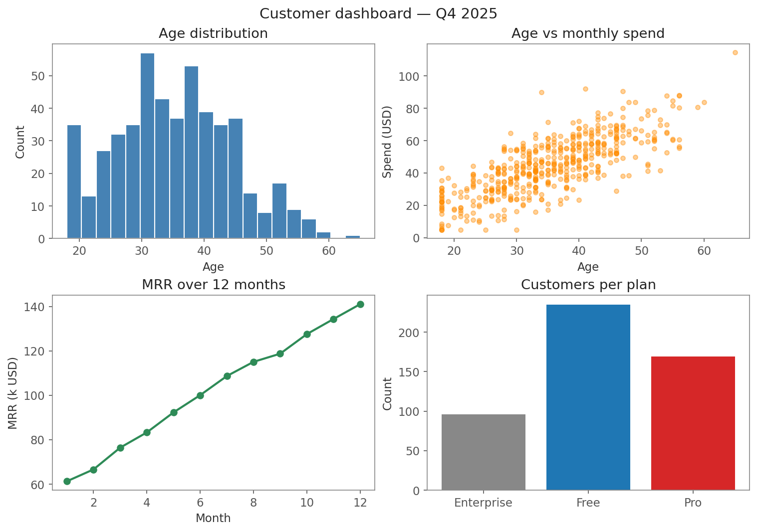
Four genuinely different views on one Figure — each axes[i, j] is its own Axes.
That’s four genuinely different views on one figure. Each axes[i, j]
is its own Axes object — same hierarchy as before, just nested.
Shared axes
If two subplots have the same units, share their axes. The eye compares them instantly and you stop wasting tick labels.
import numpy as np
import matplotlib.pyplot as plt

x = np.linspace(0, 10, 100)

# Three signals at different amplitudes — same x scale
fig, axes = plt.subplots(3, 1, figsize=(8, 5), sharex=True)

axes[0].plot(x, np.sin(x),         color="steelblue")
axes[0].set_ylabel("sin(x)")
axes[1].plot(x, 2 * np.sin(x),     color="darkorange")
axes[1].set_ylabel("2·sin(x)")
axes[2].plot(x, 0.5 * np.sin(x),   color="seagreen")
axes[2].set_ylabel("0.5·sin(x)")
axes[2].set_xlabel("x")

fig.suptitle("Same x-axis, different amplitudes")
fig.tight_layout()
plt.show()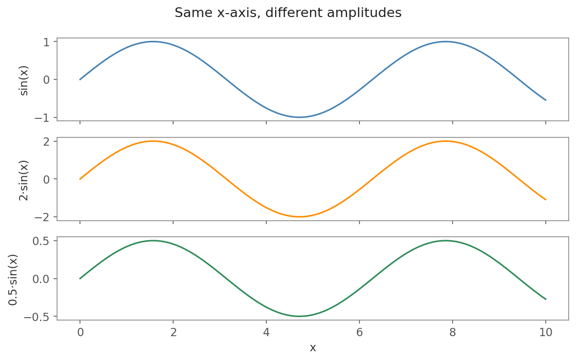
sharex=True — only the bottom panel keeps x tick labels; the eye reads all three against one timeline.
sharex=True hides the inner tick labels and locks panning/zooming
together in interactive use. sharey=True does the same vertically —
incredibly useful for small-multiples plots (many panels with the
same scale, one per group or condition) like the Anscombe quartet.
Layout managers — tight_layout vs constrained_layout
By default, matplotlib lets titles and labels overlap into adjacent panels. You almost always want a layout manager:
fig.tight_layout()              # run AFTER plotting; recomputes positions
plt.subplots(..., constrained_layout=True)   # smarter, set at creation
Rule of thumb:
constrained_layout=Truefor new code. It handles colorbars and legends better and updates as you add things.tight_layout()if you’re working in an older notebook or with third-party plots that misbehave under constrained.
Don’t mix the two on the same figure.
GridSpec for irregular layouts
A 2×2 grid is symmetric. What if you want a big plot on top and two
small ones below? That’s GridSpec:
import numpy as np
import matplotlib.pyplot as plt

x = np.linspace(0, 10, 200)

fig = plt.figure(figsize=(9, 5), constrained_layout=True)
gs = fig.add_gridspec(2, 2, height_ratios=[2, 1])

# Top: spans both columns
ax_top = fig.add_subplot(gs[0, :])
ax_top.plot(x, np.sin(x) * np.exp(-x/8), color="steelblue", linewidth=2)
ax_top.set_title("Decaying sine — full width")

# Bottom-left
ax_bl = fig.add_subplot(gs[1, 0])
ax_bl.hist(np.random.randn(500), bins=20, color="darkorange")
ax_bl.set_title("Distribution")

# Bottom-right
ax_br = fig.add_subplot(gs[1, 1])
ax_br.scatter(np.random.randn(100), np.random.randn(100),
              alpha=0.5, color="seagreen")
ax_br.set_title("Random scatter")

plt.show()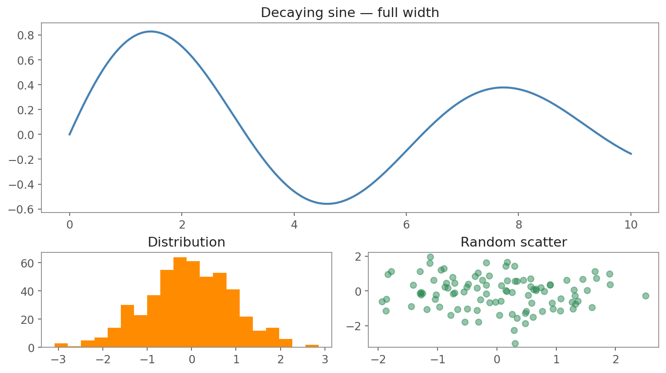
One hero chart spanning the top row (gs[0, :]), two supporting panels below — the classic dashboard shape.
gs[0, :] reads as “row 0, all columns” — slicing like NumPy. The
height_ratios=[2, 1] makes the top row twice as tall as the bottom.
This is how you build “one hero chart and two supporting charts”
dashboards.
In one breath
plt.subplots(nrows, ncols) returns the Figure plus a NumPy array of Axes — index it axes[i, j],
or loop every panel with axes.flat. When panels share units, pass sharex=True / sharey=True so the
inner tick labels vanish and the eye compares them on one scale — the engine behind small multiples.
Always run a layout manager so titles don’t collide: prefer constrained_layout=True (set at creation,
handles colorbars and legends) for new code, fall back to fig.tight_layout() otherwise — never both on
one figure. For irregular layouts (one hero chart over two supporting ones), GridSpec slices like NumPy:
gs[0, :] is “row 0, all columns,” and height_ratios sizes the rows.
Practice
Quick check
fig, axes = plt.subplots(2, 3), what's the shape of axes?sharey=True make most sense?A question to carry forward
The dashboard we just built was deliberately generic — a histogram, a scatter, a line, a bar. Handy, but interchangeable with any field. Yet some plots aren’t generic at all: they’re the specific, expected charts a machine-learning model is judged by, the ones a reviewer scans before trusting a model in production. A confusion matrix. An ROC curve. A learning curve that reveals overfitting at a glance.
So the question to carry forward is: what are the handful of plots every ML engineer is expected to ship with a model — and what does each one actually tell you? The next lesson, plots every ML engineer ships, builds the five canonical charts (confusion matrix, ROC, precision-recall, learning curve, feature importance) as copy-paste-ready recipes, each answering a distinct question about where your model succeeds and where it quietly fails.
Practice this in an interview
All questionsSmall multiples (also called trellis or facet charts) repeat the same chart structure across panels, one per category, using identical scales, axes, and visual encodings. They let viewers compare patterns across groups without the visual tangle of many overlapping lines or bars, and are the right choice when you have more than three to four groups or when overlap obscures individual trends.
Charts mislead when visual area or slope no longer encodes the underlying ratio faithfully. The three most common traps are a truncated y-axis that magnifies trivial differences, dual axes that let the designer set any ratio between scales, and 3D perspective that foreshortens far elements and inflates near ones.
An effective dashboard places the most critical metric in the top-left, groups related charts into logical sections, uses consistent scales and color across panels, limits the view to 5–9 metrics per screen, and is designed around a single primary question rather than trying to surface everything at once.
Wide format stores multiple measurements as separate columns per subject; long (tidy) format stores one measurement per row with a variable-name column and a value column. Long format is required by most statistical and visualization libraries, makes adding new variables trivial, and is the standard expected by groupby and merge operations.