Aggregations and the axis argument
sum, mean, std, percentile — and the mental model for axis that makes per-row vs per-column reductions obvious.
Written and reviewed by Shreyash Prashu Last reviewed
What you'll learn
- The standard reductions — sum, mean, std, min, max, argmin, argmax, percentile
- The
axismental model: "axis=k collapses that axis" - When to use
keepdims=Truefor clean broadcasting - Real ML statistics — per-feature stats, per-sample loss, per-class accuracy
Before you start
The last lesson ended by crossing from element-wise math into its opposite: .reduce collapsed a
whole array down to a single number. That is an aggregation, and aggregations are how you turn
raw arrays into the summaries you actually report — a million returns into one volatility, a feature
matrix into per-column means, a row of logits into one predicted class. The function names are the
easy part. The one thing that trips everyone is the axis argument, so that is where we start.
The mental model: axis=k collapses that axis
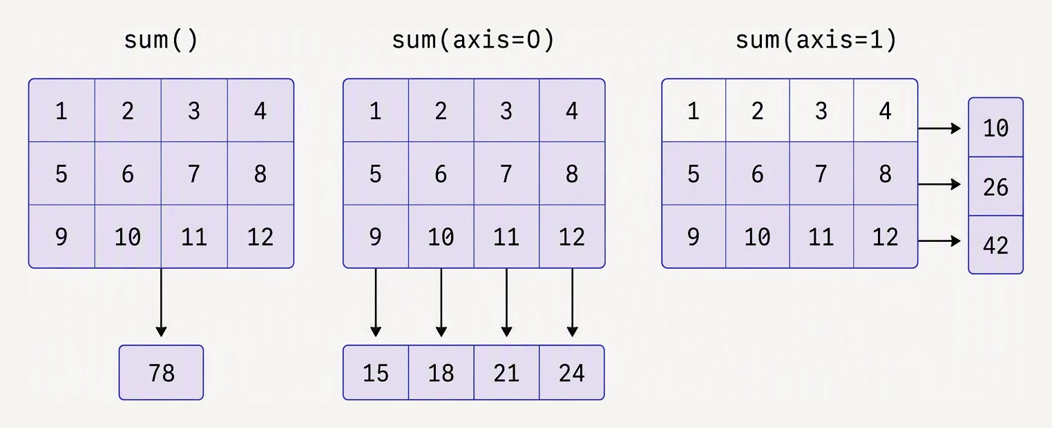
The axis you name is the axis that disappears.
Take a (n_samples, n_features) matrix. Do you want “the mean of each feature” or “the mean of each
sample”?
axis=0collapses the row axis → one value per column (per feature).axis=1collapses the column axis → one value per row (per sample).
Read it as: “remove axis k from the shape.”
import numpy as np

# 5 samples × 4 features (e.g., height_cm, weight_kg, age, score)
X = np.array([
    [170, 65, 25, 0.8],
    [180, 80, 30, 0.7],
    [165, 55, 22, 0.9],
    [175, 70, 28, 0.75],
    [160, 50, 35, 0.6],
], dtype=float)

print("X.shape:", X.shape)

# Per-feature mean — collapses the rows axis (axis=0).
print("\nmean per feature  :", X.mean(axis=0))
print("shape             :", X.mean(axis=0).shape)   # (4,)

# Per-sample mean — collapses the cols axis (axis=1).
print("\nmean per sample   :", X.mean(axis=1))
print("shape             :", X.mean(axis=1).shape)   # (5,)

# Mean of everything — no axis.
print("\noverall mean       :", X.mean())
X.shape: (5, 4)
mean per feature : [170. 64. 28. 0.75]
shape : (4,)
mean per sample : [65.2 72.675 60.725 68.4375 61.4 ]
shape : (5,)
overall mean : 65.6875axis=0 ate the 5 rows and left 4 feature-means; axis=1 ate the 4 columns and left 5
sample-means. If you can’t remember which is which, print the output shape — the axis that
disappeared is the one you collapsed.
Which axis disappears under aggregation?
The array below has shape (3, 4, 2). Pick an axis button — the highlighted cells are the ones that get folded together. The resulting shape drops that axis entirely.
(3, 4, 2)(4, 2)np.sum(arr, axis=0) → (4, 2)The full toolkit
These are all both method and function: arr.sum() and np.sum(arr) both work.
sum         — total
mean        — average
std, var    — standard deviation / variance
min, max    — extremes
argmin, argmax — index of the extreme (per axis)
ptp         — peak-to-peak range (max − min)
median      — middle value
percentile, quantile  — order statistics
prod, cumsum, cumprod — multiplicative / running
any, all    — boolean reductions
import numpy as np
rng = np.random.default_rng(7)
returns = rng.standard_normal(252) * 0.01 # 1 year of daily returns
print(f"mean daily return : {returns.mean()*100:6.3f}%")
print(f"std (volatility) : {returns.std()*100:6.3f}%")
print(f"worst day : {returns.min()*100:6.3f}%")
print(f"best day : {returns.max()*100:6.3f}%")
print(f"day of worst loss : {returns.argmin()}")
print(f"median : {np.median(returns)*100:6.3f}%")
print(f"5% VaR (1-day) : {np.percentile(returns, 5)*100:6.3f}%")
print(f"95% VaR (1-day) : {np.percentile(returns, 95)*100:6.3f}%")mean daily return : -0.171%
std (volatility) : 0.921%
worst day : -3.251%
best day : 2.245%
day of worst loss : 250
median : -0.131%
5% VaR (1-day) : -1.715%
95% VaR (1-day) : 1.338%That is the basic shape of risk reporting: aggregate a return stream into the handful of summary
statistics a risk committee actually reads (argmin even points to which day — index 250 — was
the worst).
keepdims — preserving the axis for broadcasting
The annoying thing about aggregations is that they drop the collapsed axis by default — which breaks broadcasting the moment you want to use the result back against the original array.
import numpy as np

# 5 samples × 4 features.
X = np.array([
    [1.0, 100, 0.01, 50],
    [2.0, 150, 0.02, 60],
    [3.0, 200, 0.03, 70],
    [4.0, 180, 0.025, 65],
    [5.0, 250, 0.035, 80],
])

# Center each feature (zero mean per column).
col_mean = X.mean(axis=0)              # shape (4,) — fine, broadcasts on axis 0
X_centered = X - col_mean
print("centered, col-mean now ~0:", X_centered.mean(axis=0).round(10))

# But center each sample (zero mean per row)?
row_mean_bad = X.mean(axis=1)          # shape (5,) — won't broadcast against (5,4)!
try:
    X - row_mean_bad
except ValueError as e:
    print("\nfailed:", e)

# Fix: keepdims=True keeps the axis as size 1.
row_mean = X.mean(axis=1, keepdims=True)   # shape (5, 1) — broadcasts column-wise
print("\nrow_mean shape   :", row_mean.shape)
X_rownorm = X - row_mean
print("row-centered, row-mean now ~0:", X_rownorm.mean(axis=1).round(10))
centered, col-mean now ~0: [0. 0. 0. 0.]
failed: operands could not be broadcast together with shapes (5,4) (5,)
row_mean shape : (5, 1)
row-centered, row-mean now ~0: [0. 0. 0. 0. 0.]Per-column centering worked because (4,) broadcasts cleanly against (5, 4). Per-row centering
failed because (5,) tries to align its 5 against the 4 columns — the broadcasting trap from two
lessons ago. keepdims=True keeps the collapsed axis as size 1, giving (5, 1), which broadcasts
down the columns exactly as you want.
argmin and argmax — where is the extreme?
These return the index of the min/max element, not the value itself — the bridge from scores to decisions.
import numpy as np

# 4 samples, each a row of 4 class probabilities.
logits = np.array([
    [0.1, 0.7, 0.1, 0.1],   # → class 1
    [0.3, 0.2, 0.4, 0.1],   # → class 2
    [0.05, 0.05, 0.1, 0.8], # → class 3
    [0.6, 0.2, 0.1, 0.1],   # → class 0
])

# Predicted class = argmax over axis 1 (the class axis).
pred = logits.argmax(axis=1)
print("predicted class:", pred)

true = np.array([1, 2, 3, 1])
print("true class     :", true)
print("accuracy       :", (pred == true).mean())
predicted class: [1 2 3 0]
true class : [1 2 3 1]
accuracy : 0.75argmax(axis=1) is the way to turn a logits matrix into class predictions — you will write this
line in nearly every classification notebook. (Here the last sample predicted class 0 but the truth
was 1, so accuracy is 3/4 = 0.75.)
Per-class accuracy with boolean masks
A real-world aggregation: don’t just compute overall accuracy, compute it per class so you can spot the class your model is failing on.
import numpy as np

rng = np.random.default_rng(42)
true = rng.integers(0, 3, size=200)            # 3 classes, 200 samples
pred = true.copy()
# Inject 30% noise into class 2 predictions
mask = (true == 2) & (rng.random(200) < 0.3)
pred[mask] = (pred[mask] + 1) % 3

# Per-class accuracy.
for c in range(3):
    in_class = true == c
    correct = (pred[in_class] == c).mean()
    print(f"class {c}: {in_class.sum():3d} samples, accuracy {correct:.2%}")

print(f"overall : {(pred == true).mean():.2%}")
class 0: 58 samples, accuracy 100.00%
class 1: 72 samples, accuracy 100.00%
class 2: 70 samples, accuracy 65.71%
overall : 88.00%The overall 88% hides the real story: classes 0 and 1 are perfect, but class 2 — where we injected noise — sits at 65.71%. A single aggregate number would have buried that; splitting by class surfaced it.
In one breath
An aggregation collapses an array to a summary, and the axis argument decides which axis
disappears: axis=0 eats the rows → one value per column (per feature), axis=1 eats the
columns → one value per row (per sample), no axis → one scalar. The toolkit is sum, mean,
std/var, min/max, argmin/argmax (the index of the extreme — argmax(axis=1) turns
logits into class predictions), median, percentile. Because reductions drop the collapsed axis,
using the result back against the original (per-row centering) breaks broadcasting until you pass
keepdims=True to keep it as size 1. Pair axis= with boolean masks and you get per-class /
per-segment metrics in a handful of lines.
Practice
Quick check
(100, 10) matrix X representing 100 samples × 10 features, what does X.std(axis=0) give you?X - X.mean(axis=1) to subtract each row's mean. Why does it fail, and what's the fix?(batch, num_classes), how do you get the predicted class for each sample?A question to carry forward
Look back at how the per-class accuracy was actually computed. true == c produced a boolean
array; (pred == true).mean() fed booleans straight into a mean to count the Trues; pred[mask]
pulled out a scattered subset. We have leaned on boolean arrays as filters all through this lesson
without ever studying them head-on.
They are the single most-used tool in real data work — the thing every Pandas df[df.col > 0] and
.loc[] query is, underneath. So the next lesson, which closes the Vectorization chapter, is all
about them. How do you build a mask, combine masks with &, |, ~ (and why do the
parentheses around each condition matter so much), count and locate the Trues, and grab, modify,
or replace exactly the elements a condition selects?
Practice this in an interview
All questionsagg collapses each group into a single scalar, returning a result with one row per group. transform returns a Series or DataFrame with the same index as the original, broadcasting the group-level result back to every row — making it ideal for adding derived columns without a merge.
rolling() computes statistics over a fixed-size sliding window, discarding data outside the window; expanding() grows the window from the first row to the current row, equivalent to an ever-increasing cumulative calculation. Both return objects you chain .mean(), .sum(), .std(), or a custom .apply() onto.
pivot reshapes long-format data to wide by spreading a column's values into new column headers — it requires unique index/column combinations and has no aggregation. pivottable is the aggregating version that handles duplicates via a specified aggfunc. melt is the inverse: it takes wide-format data and collapses multiple columns into key-value rows (long format).
SQL's standard aggregate functions are COUNT, SUM, AVG, MIN, and MAX. MIN and MAX work on any orderable type including strings and dates, using the type's collation or sort order, which surprises analysts who expect numeric-only semantics.