ACF & PACF
How ACF and PACF plots reveal the AR and MA order fingerprints that guide ARIMA model selection.
Written and reviewed by Shreyash Prashu Last reviewed
What you'll learn
- ACF measures correlation between a series and its own lagged values; PACF isolates that correlation after removing shorter-lag effects.
- An AR(p) signature: PACF cuts off after lag p, ACF tails off; an MA(q) signature: ACF cuts off after lag q, PACF tails off.
- Significance bands at roughly plus-or-minus 2 divided by the square root of n mark which lags are statistically meaningful.
Before you start
The last lesson got your series stationary and gave you the d in ARIMA. It also kept hinting at two more
letters — p and q — and at “a negative spike in the ACF.”
This lesson cashes that hint in: two plots that read a stationary series’ internal correlation like a fingerprint and point you straight at the right model orders.
What is autocorrelation?
A lag is a time offset. Lag 1 means “one step back in time,” lag 2 means “two steps back,” and so on.
Autocorrelation at lag k is the ordinary Pearson correlation between the original series and a copy of itself shifted k steps into the past. If today’s value tends to resemble yesterday’s value, the lag-1 autocorrelation is high. If the series has a weekly cycle, lag-7 autocorrelation will spike.
The full set of autocorrelations across lags 0, 1, 2, … forms the Autocorrelation Function (ACF). By definition, lag-0 autocorrelation is always 1.
What is partial autocorrelation?
Partial autocorrelation at lag k asks a tighter question: what is the correlation between the series and its lag-k version after removing the influence of all the lags in between (lags 1 through k−1)?
Think of it this way. If lag-1 autocorrelation is strong, it will automatically create apparent correlation at lag 2 simply because today relates to yesterday and yesterday relates to the day before. The PACF strips that indirect path away, leaving only the direct association at each lag.
The Partial Autocorrelation Function (PACF) collects these cleaned-up correlations across lags.
Reading the fingerprints
The practical value of ACF and PACF comes from two classic patterns that distinguish AR and MA processes.
AR(p) signature
An autoregressive process of order p uses the last p observations directly. Its fingerprint:
- PACF cuts off sharply after lag
p— beyond that, partial correlations are near zero. - ACF tails off — it decays gradually (exponentially, or in a damped sinusoidal fashion) without a clean cutoff.
The PACF cutoff tells you p almost directly. If PACF is significant at lags 1 and 2 but essentially zero from lag 3 onward, try AR(2).
MA(q) signature
A moving-average process of order q is built from the last q error terms. Its fingerprint is the mirror image:
- ACF cuts off sharply after lag
q. - PACF tails off gradually.
If ACF is significant only at lag 1 and is near zero from lag 2 onward, try MA(1).
Mixed ARMA
When both ACF and PACF tail off (neither cuts off cleanly), the series likely has both AR and MA components. That is the signal to try ARMA(p, q) combinations, usually starting small.
Significance bands
Not every non-zero bar in an ACF or PACF plot is meaningful. Under the null hypothesis of no autocorrelation, sample autocorrelations are approximately normally distributed with standard error of roughly 1 divided by the square root of n, where n is the number of observations.
The conventional significance band is plus-or-minus 2 divided by the square root of n (a 95 % threshold). Bars that stay inside the band are consistent with noise. Only bars that poke outside the band warrant attention.
Most plotting libraries draw these bands for you as dashed horizontal lines.
The AR(1) signature in pictures
The diagram below shows what ACF and PACF look like for a simulated AR(1) process. The ACF decays gradually across lags (tailing off), while the PACF drops to near zero immediately after lag 1 (cutting off). The dashed lines mark the approximate significance band.
AR(1) fingerprint: ACF decays exponentially across lags (tails off); PACF is significant only at lag 1 and is near zero thereafter (cuts off). Dashed lines mark the approximate significance band.
Computing ACF by hand
The formula for the sample autocorrelation at lag k is:
- Subtract the series mean from every value to get mean-centered values.
- Compute the dot product of the mean-centered series with a copy of itself shifted by
ksteps. - Divide by the dot product at lag 0 (which equals the total variance times n).
The playground below walks through this computation so you can watch the decay unfold.
import numpy as np
import matplotlib.pyplot as plt

np.random.seed(0)

# Simulate an AR(1) process: x_t = phi * x_{t-1} + noise
n = 200
phi = 0.8
noise = np.random.normal(0, 1, n)
x = np.zeros(n)
for t in range(1, n):
    x[t] = phi * x[t - 1] + noise[t]

# --- Compute ACF by hand ---
max_lag = 12
x_centered = x - x.mean()
var = np.dot(x_centered, x_centered)   # denominator: variance * n

acf_values = []
for k in range(max_lag + 1):
    # Align: x_centered[k:] with x_centered[:n-k]
    cov_k = np.dot(x_centered[k:], x_centered[: n - k])
    acf_values.append(cov_k / var)

lags = np.arange(max_lag + 1)
significance_band = 2 / np.sqrt(n)   # approximate 95% band

fig, ax = plt.subplots(figsize=(7, 3.5))
ax.vlines(lags, 0, acf_values, colors="#5b7fe9", linewidth=4)
ax.scatter(lags, acf_values, color="#5b7fe9", zorder=3, s=30)
ax.axhline(0, color="#888", linewidth=1)
ax.axhline( significance_band, color="#e07b39", linewidth=1, linestyle="--", label="±2/√n band")
ax.axhline(-significance_band, color="#e07b39", linewidth=1, linestyle="--")
ax.set_xlabel("Lag")
ax.set_ylabel("Autocorrelation")
ax.set_title("ACF computed by hand — AR(1) with phi=0.8")
ax.legend(fontsize=9)
plt.tight_layout()
plt.show()
print("ACF values:", [round(float(v), 3) for v in acf_values])
ACF values: [1.0, 0.848, 0.732, 0.629, 0.543, 0.521, 0.491, 0.49, 0.457, 0.408, 0.379, 0.325, 0.321]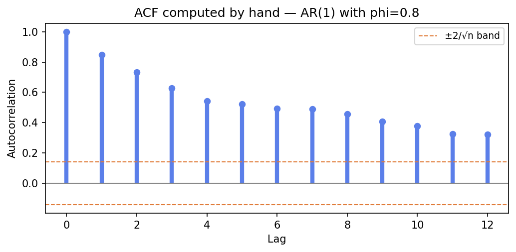
Every bar positive, decaying monotonically — the hallmark “tailing off” of an AR process. Lag-1 ≈ 0.85 (≈ phi), each step shrinking by roughly a factor of phi.
The numbers confirm it: lag-1 is 0.848 (almost exactly phi = 0.8), and each subsequent bar is smaller than the last.
That answers the prediction: the lag-2 bar (0.732) is smaller than lag-1. The bars shrink by roughly a factor of phi each step, which is the theoretical ACF of an AR(1). (Flip phi to a negative value like -0.7 and the bars alternate in sign but still decay — still tailing off, just oscillating.)
Using statsmodels in practice
Hand-computing ACF is instructive, but in a real workflow you will use statsmodels — and it draws the PACF too, which is the half that pins down the AR order. Run it on the same AR(1) x:
from statsmodels.graphics.tsaplots import plot_acf, plot_pacf
import matplotlib.pyplot as plt

fig, axes = plt.subplots(1, 2, figsize=(10, 4))
plot_acf(x, lags=20, ax=axes[0])
plot_pacf(x, lags=20, ax=axes[1], method="ywm")
plt.tight_layout()
plt.show()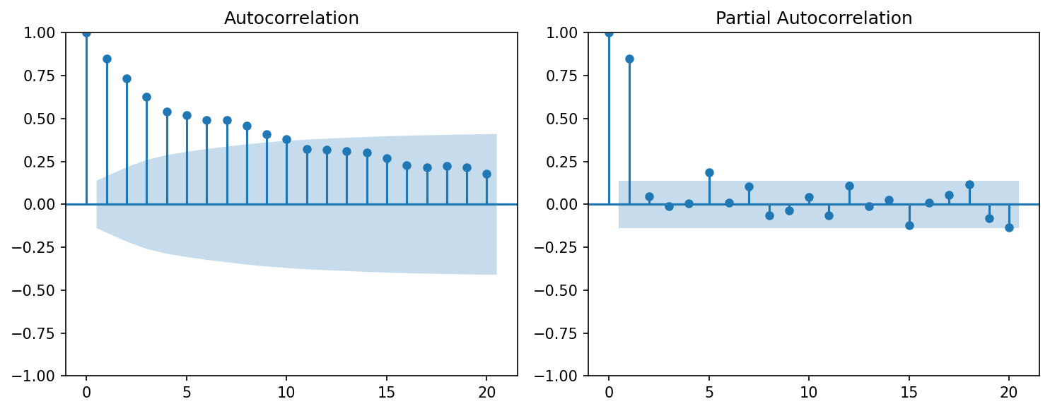
The real AR(1) fingerprint: ACF tails off (left), PACF cuts off hard after lag 1 (right) — pointing straight at AR(1).
There it is in real data: the ACF tails off (left, a long gradual decay) while the PACF cuts off after lag 1 (right, one tall spike then nothing). That is the unmistakable AR(1) signature.
plot_acf and plot_pacf handle the significance shading automatically. The method="ywm" (Yule-Walker
with bias correction) is the recommended default for PACF.
Putting it together: the Box-Jenkins identification step
The classic workflow for choosing ARIMA orders is:
- Make the series stationary (difference as needed — see the stationarity lesson).
- Plot ACF and PACF on the stationary series.
- If PACF cuts off at lag
pand ACF tails off, start with AR(p). - If ACF cuts off at lag
qand PACF tails off, start with MA(q). - If both tail off, try small ARMA(p, q) combinations.
- Fit, check residuals, and use AIC or BIC to compare candidates.
ACF and PACF give you a shortlist, not a definitive answer. Always validate the chosen model by checking that its residuals look like white noise.
In one breath
ACF at lag k is the plain correlation of the series with a copy of itself shifted k steps; PACF asks the same but after removing the influence of all shorter lags, leaving only the direct link.
Two mirror-image fingerprints choose your ARIMA orders:
- An AR(p) has PACF that cuts off sharply after lag p while the ACF tails off.
- An MA(q) has ACF that cuts off after lag q while PACF tails off.
- When both tail off, it’s mixed ARMA.
Only bars poking outside the ±2/√n significance band count.
Crucially, read these only on a stationary series. On a trending one every lag is significant because the mean is drifting, not because the process is autoregressive.
Practice
Quick check
A question to carry forward
We’ve been reading a fingerprint without meeting the suspect. “PACF cuts off after lag p → AR(p)” — but what is an AR(p) process?
The lesson kept simulating one (x_t = phi·x_{t-1} + noise) to generate the plots, yet never stopped to ask
what that recipe actually models, or why its PACF behaves that way.
So the question to carry forward is: what does the AR(p) model say about how a series evolves, and why does its PACF cut off exactly at lag p?
The next lesson, autoregression (AR), is the model behind the fingerprint. It covers predicting tomorrow
as a weighted blend of its own recent past, how the coefficient phi tunes persistence versus mean-reversion,
and how you fit it (and read p straight off the PACF) in practice.
Practice this in an interview
All questionsThe ACF measures correlation between a series and its own lags including indirect effects; the PACF strips out those indirect effects to show direct correlation at each lag. A cut-off in the PACF after lag p signals an AR(p) process; a cut-off in the ACF after lag q signals an MA(q) process.
Choose d by differencing until the ADF test confirms stationarity; choose p from the PACF cutoff and q from the ACF cutoff on the differenced series; then confirm with AIC or BIC to guard against over-fitting. In practice, an automated grid search over a small range of candidates with information criteria is more reliable than visual inspection alone.
Prophet is a curve-fitting model that decomposes the series into trend, seasonality, and holidays; it handles missing data, multiple seasonalities, and non-uniform time grids with minimal tuning and is accessible to non-statisticians. ARIMA is a statistical model based on autocorrelation structure; it is more appropriate when the series is short, noise is small, and you need principled uncertainty intervals from an explicit stochastic process.
ARIMA(p,d,q) models non-seasonal series by combining autoregression, differencing, and a moving average of errors. SARIMA extends it with a second set of seasonal parameters (P,D,Q,s) that operate at the seasonal lag s, handling periodic patterns that ARIMA alone cannot capture.